Designers and advertisers from around the world get their hands dirty, dive to new depths, and more to bring us the best advertising out there!
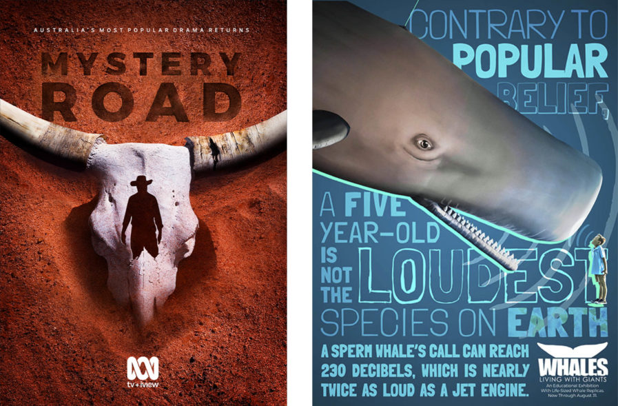
“Mystery Road” (above, left) is a Gold-winning promotional poster created by ABC Made for the second season of the popular Australian series of the same name. The neo-Western-crime mystery series is a spin-off from Ivan Sen’s feature films “Mystery Road” and “Goldstone”, serving as a bridge between the two. For the show’s upcoming season, fan-favorite character detective Jay Swan is returning to the scene to investigate a new and darker murder. With a need to announce the show’s anticipated return while also highlighting the western genre and storyline and referencing the local locations and impressive cinematography, the concept came together in a visually striking poster that portrays the show’s iconic graphic of a brahman bullhead’s skull emerging from the red Australian dirt, and stamped with the recognizable silhouette of Detective Jay Swan. The show’s title is also seemingly imprinted into the sand above the bull’s skull in bold lettering. The agency’s key art was extremely well-received, and Mystery Road season two went on to win the AACTA Award for Best Drama Series and several other acting awards.
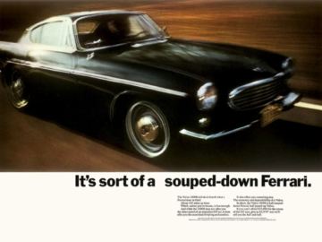
The next Gold-winning design is a poster by PPK, an independent advertising agency based in California. Their assignment was to develop a poster, digital ad, and social assets that would create excitement and awareness for a new educational whale exhibition at the Clearwater Marine Aquarium in Clearwater, Florida, which featured a variety of amazing life-sized whale replicas and in-depth learning on these gentle giants. With “Deeper Learning” (above, right), the team at PPK wanted to emphasize the educational nature of the new exhibit, which is called “Whales: Living With Giants”, in a fun, interesting, and attention-getting way.
To do so, the agency played off an “astounding fact about the decibel level of a sperm whale’s call while showing the immense scale of these life-sized whale replicas in comparison to a kid.” To emphasize the “loud” decibel level, PPK also used bold and dynamic type treatment to complement the humorous concept and imagery. Upon seeing PPK’s poster design, the Clearwater Marine Aquarium’s marketing team loved how the agency focused on the educational aspects of this exhibition and brought it to life in an entertaining family-friendly way. This big, bold, thought-provoking concept really stood out and captured people’s attention contributing to impressive attendance numbers at this exhibition. It has been such a success that the Clearwater Marine Aquarium is planning to introduce another exhibition in the fall.


