If something looks good to you, it has to be the branding. How things look goes a long way in drawing people’s interest, and these Design 2022 winners make a statement with polished yet fun work.
Rathaus is a film production company based in New York, Detroit, and Antigua and Barbuda with a focus on progressive films, branded content, and music videos. Beginning with a frat house with a rat problem that gave the company its name, Rathaus has developed a down-to-earth feel with a darkly comedic tone, and playfully embraces the name and the raw/refined aspects of film production. Founders and partners Madeleine Askwith, Alexandra Byer, Shabier Kirchner, and Kevin Steen pride themselves on a scrappy identity and resourceful work ethic, which they hope to put on full display in their new brand identity.
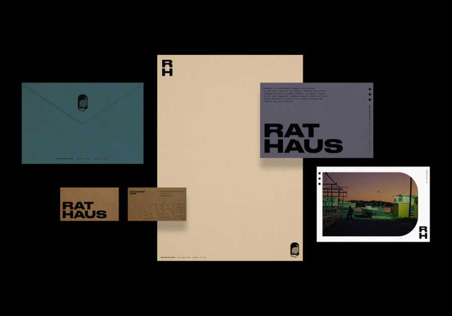
In a media landscape overloaded with clean-cut or flashy designs, this small film company takes a subtler branding approach thanks to the amazing work of Paolo Catalla’s design firm. His unique take on “Rathaus Branding” (above) took home 2022 Design gold, referencing the company’s humble roots with a design that will carry Rathaus far into the future. Catalla makes excellent use of typography and negative space with thick, bold text on top of desaturated color fields. Other elements of the brand reference aspects of the industry, including stylized photography reminiscent of old film and text in the shape of film strips. Catalla also creates a logo to suit Rathaus’ name while affectionately mocking the company’s history with a simple, monochrome graphic of a rat disappearing into its hole. Rathaus’ industry-defying new identity is sure to bring attention to their future work.
