Telling Stories With Posters: Scott Laserow Featured in Graphis Journal #372

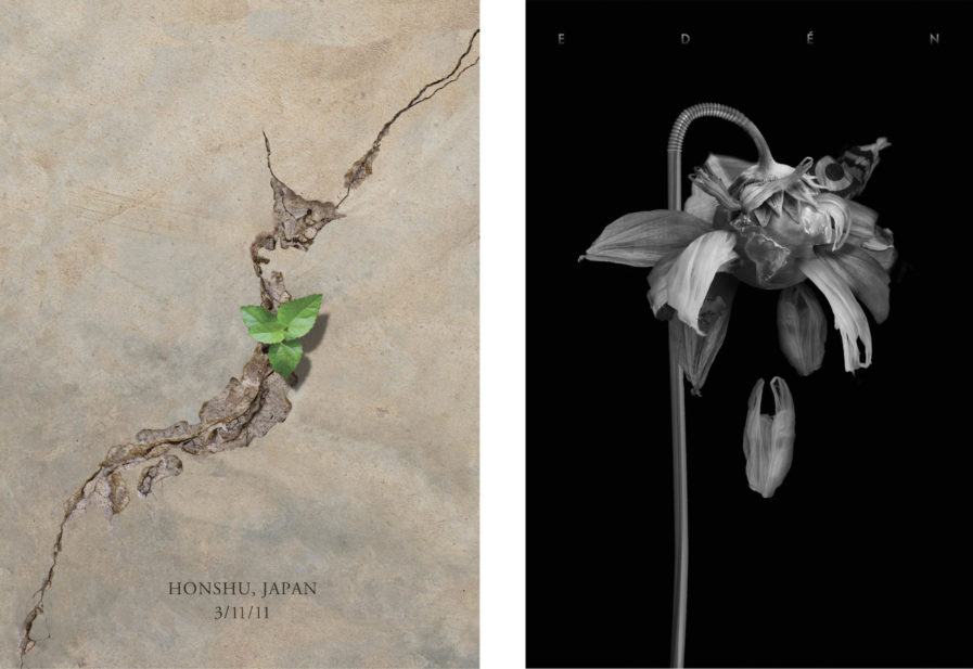
It takes only a second to look at and take in the content of a poster, so you need it to be able to capture what you want to convey in a single striking image. Scott Laserow, a graphic and poster designer who blends traditional graphic design techniques with emerging technologies, has that down to a science. Since 2005, he has focused increasingly on political, social, and environmental posters, as both a design challenge and an instrument for social change. He also recently started exploring the relationship between interactive technology and its effects on traditional poster design. His new research includes looking into animated, augmented reality, as well as investigating interactive posters and how they engage a new generation. Most recently, Laserow published a book, along with co-author Natalia Delgado, on poster design entitled Making Posters: From Concept to Design.

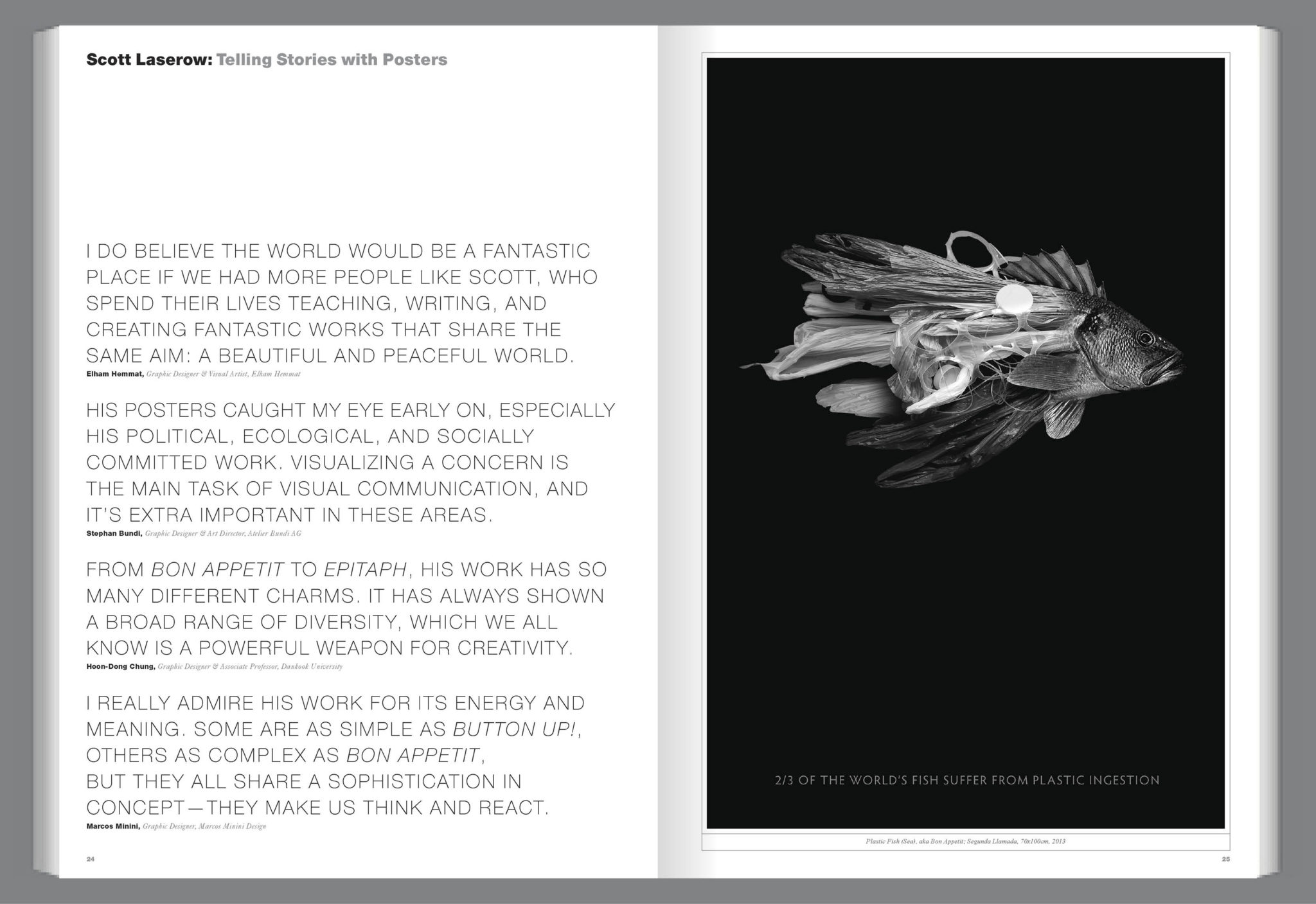
His work “shows a broad range of diversity”, as mentioned by Hoon-Dong Chung, a graphic designer and associate professor at Dankook University, and as such his posters have “so many different charms.” Using minimalism alongside plenty of research into the issue his work is addressing, Laserow creates direct, impactful work that seems simple but is filled with hidden meanings that make you want to look closer.
8

What inspired or motivated you in your career?

I was in college, a biology major of all things, and took a graphic design class on a lark. My design professor said she thought I had talent, and if I wanted to make graphic design my career, I should find a school with a good design program. So that’s what I did. Since I went to design school in the ‘80’s, New Wave type, Memphis design, and David Carson’s Ray Gun magazine shaped the way I looked at design early in my career. As my career progressed, it became more about self-motivation, never being satisfied with my work and continually pushing myself to improve. I think this unattainable idea of perfectionism is common among designers. I have been and still am inspired and fascinated by how international graphic designers approach their craft. Each part of the world, like food, has a different flavor palette. Seeing how other cultures solve problems is exciting.

What is your work philosophy?

My overall personal aesthetic is a minimal approach to graphic design. Only place necessary visuals on the page and nothing more. As part of the process, I feel it is essential to educate yourself as much as you can about the project at hand. I always start by doing as much research as I can about a subject or topic. A strong concept is also crucial to me. Of course, this reveals itself differently depending on the form. When it comes to layout, this might be physical size and/or shape, paper stock, or color palette; the way it’s bound may play a role that helps with the communication of the publication. With a poster or a logo, it’s all about narrative. I want to tell a memorable story. Lastly, with aesthetic, even if the image may be unpleasant, execute it in a way that seduces. My poster “Plastic Fish” was once described as “grotesque beauty.” For me, this is the ultimate compliment.

What do you like best about design?

That’s easy; teaching it. That’s when I’m at my happiest.

While you design print media, web and interactive designs, and animations, you are particularly known for your posters. What about posters do you like the most?

Designing posters is the closest thing to fine art that graphic designers get to practice. Posters are conceptually freeing and often offer the designer an opportunity for storytelling. However, posters certainly don’t have to be illustrative to be successful and memorable; there are many brilliant typographic posters. For me, it’s an opportunity to flex my image-making muscles. Designing posters has helped me grow as a designer, as they force you to think very deeply about a topic. You only have seconds to grab attention with a poster, so your image (visual or typographical) must be powerful and immediate, yet simultaneously create an intimacy with the audience, hoping they leave the experience with a lasting impression. I focus
heavily on the concept in hopes that my posters won’t rely on written typography. I believe if an image can communicate without a typographic explanation, then you know you have something. Most of my poster work is international, so not wholly relying on type becomes even more critical.

To read the full interview and to see more of Scott Laserow’s work, preorder Graphis Journal #372 at graphis.com.

Author: Graphis