Another week, another opportunity to show off more of last year’s advertising competition Platinum, Gold, and Silver winners. These entries’ unique and effective designs are not only what distinguishes them from other ads but also makes them effective for their clients.
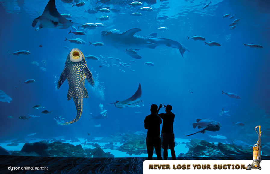
First up is Platinum winner “Never Lose Your Suction” (above), created by Colin Corcoran for Dyson Vacuums. Corcoran wanted to create a memorable advertisement while reflecting the concept of being one of the world’s most innovative companies (aka the “Apple of England”). He also wanted to help transform the boring brand image Dyson used for their aesthetically exciting portfolio of vacuums so that consumers’ perspectives of the brand would change. “No Loss Of Suction” represents Dyson’s power in a dramatic fashion, depicting items known for their suction. To add more detail, Corcoran included custom typeface designs created using dirt, dust, coffee beans, and spilled cereal to form different alphabets of debris. Unfortunately, since Dyson remains a privately held company, campaign results were requested to be kept confidential.
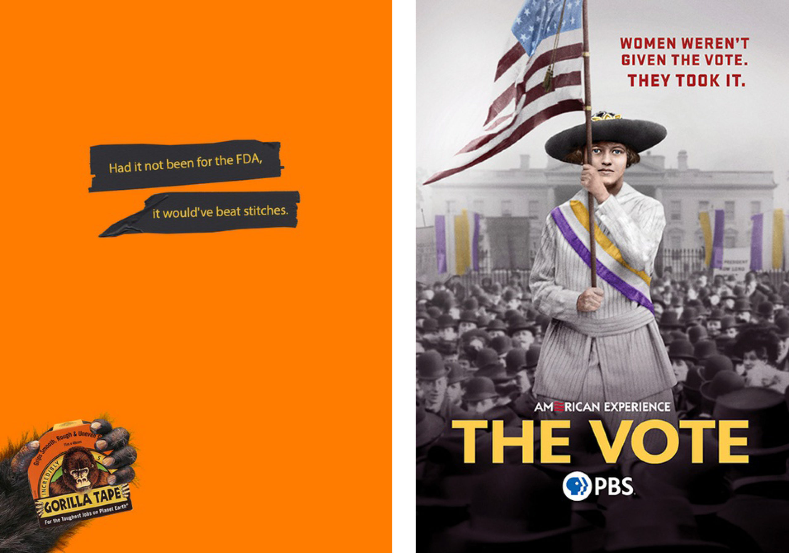
Our Gold winner uses the idea of “simple yet effective” to great success. “It Sticks” (above, left) was created for Gorilla Tape by Samruddhi Pawar. Produced by the same company that produces Gorilla Glue, Pawar’s assignment was to spread awareness for the product, which he did with some simple design elements. The bright orange of the advertisement is automatically eyecatching but add in a gorilla’s hand holding the product and the funny tagline, “Had it not been for the FDA, it would’ve beat stitches,” and to have an ad that shows off the brand’s quirky personality and really sticks with you!
Finally, we have “The Vote” (above, right). SJI Associates art director and designer David O’Hanlon made this Silver-winning advertisement for Karla Jones and Derrick Chamlee at PBS. The purpose was to convey the power of a transformative cultural and political movement that resulted in the largest expansion of voting rights in U.S. history. O’Hanlon’s focus was on a singular image of a suffragist whose gaze captures the viewer’s attention, along with a crowded scene in front of the White House. This tells the story of this hard-fought campaign waged by American women for the right to vote. The advertisement was successful in achieving its goal, driving interest and awareness for the film, and was repurposed for social and digital which resulted in increased tune-in and streaming views.
Feeling competitive and want to see how your designs compare? Our Advertising Annual 2022 competition will be accepting entries until June 22, 2021.