The Power of Books: Four New Poster Annual 2022 Entries

Who doesn’t love a good book? Maybe music or TV is more your speed? Two of this week’s Poster Annual 2022 posters encourage everyone to read more books, while our two other entries promote new music and TV. 

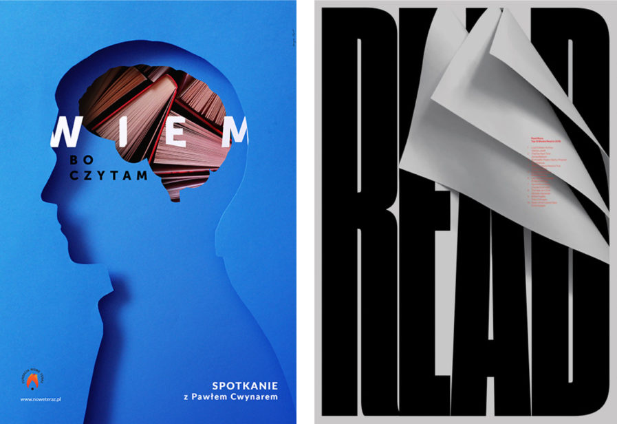
Katarzyna Zapart graduated with her M.A. from the Academy of Fine Arts in Kraków, Poland, and specializes in branding and poster design. “I Know Because I Read” (above, left) was created to endorse the “I Know Because I Read” educational campaign to promote reading amongst troubled youth, convicts, and marginalized students. This project is led by Pawet Cwynar, an ex-gang member, and is meant to show the advantages of devoting time to reading and writing. Zapart’s poster features a blue silhouette with the brain replaced with book pages, indicating the positive scientific effects reading has on reducing stress, increasing creativity, and stimulating the mind. This simple yet cohesive design excels at emphasizing reading’s ability as a form of rehabilitation. 

Canadian designer Fidel Peña studied graphic design at George Brown College, graduating in 1995. He’s a creative director/partner for Underline Studio, a strategic branding and design agency based in Toronto. Their motto is: “We help you change things. For the better. By design.” Peña’s poster “Read More” (above, right) depicts a very realistic 3D magazine with “read” in bold, block typeface. The top right corner cleverly mimics three different pages of a magazine folded over, revealing a list of the top ten books to read in 2019. Like Zapart’s piece, this minimalist poster advocates for the importance of reading. 
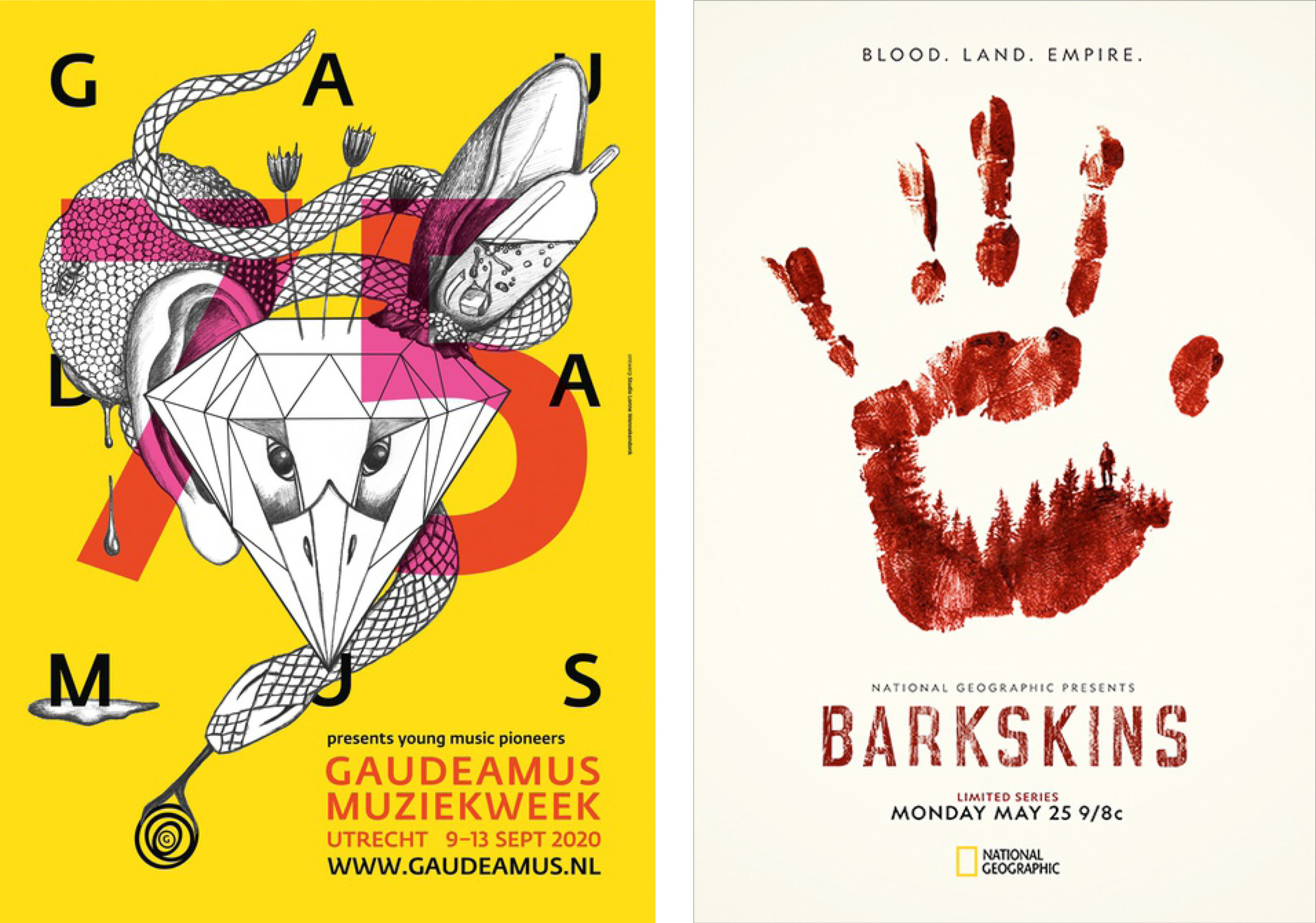
Studio Lonne Wennekendonk is a design studio based in Rotterdam, the Netherlands. They pride themselves on listening to both the client and the consumer’s needs to create the best possible design and believe this is how they can inspire people and spark change. Their poster “Gaudeamus Muziekweek 2020” (above, left) was created for the aforementioned annual music festival that, for seventy-five years, has presented up and coming young artists that are pioneering the music of tomorrow. The poster has an eclectic collection of hand-drawn objects, plants, and animals, with a bright red “75” tucked amongst the items. The yellow background represents the artists’ youth and energy, and ties together a poster as beautiful as the music it promotes. 

“An idea does not live without proper execution and there is no execution without an idea,” according to California design agency ARSONAL. “Barkskins” (above, right) promotes National Geographic’s TV drama Barkskins, a historical drama centered on a group of outcasts navigating the new frontier in France. The simple bloody handprint in this design delicately includes the crest of a hill with trees crawling up and an ominous figure of a man looking out. The words “Blood. Land. Empire.” are situated above the fingertips, indicating the premise of the show while maintaining a sense of mystery. 

February 15th is the deadline for our Poster Annual 2022 competition, so enter now! And don’t forget to check out other entries here

Author: Graphis

Leave a Reply

Your email address will not be published. Required fields are marked *