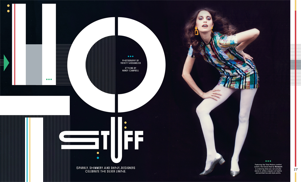
In the world of magazine publishing, design is just as important as the content, especially when it comes to typography. Incorporating creative and unique typographic design into an editorial spread not only draws the reader in but also enhances the story it’s accompanying. Trevett McCandliss and Nancy Campbell from Wainscot Media know this all too well, being master editorial creators and using their very own custom typefaces to take each of the fashion spreads to new, unique heights.
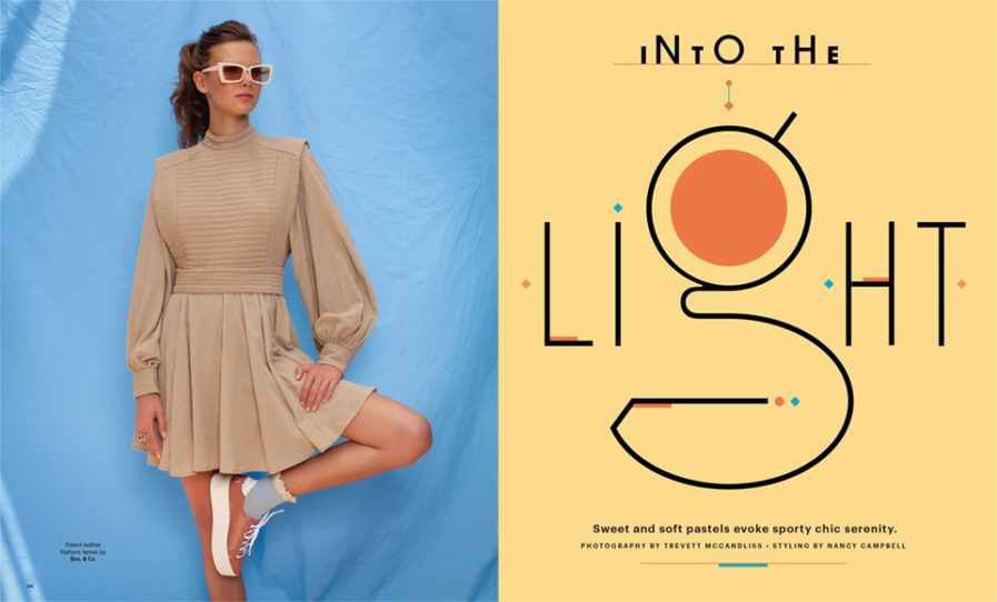
The designer’s first spread is named “Into the Light” (above) which was created for Footwear Plus Magazine, a leading B-2-B fashion publication of the footwear industry and a frequent client of McCandliss and Campbell. For their approach to the project, the two created an airy and harmonious fashion story told through a mellow color palette and their linear typeface design. On the left page, a model can be seen standing in front of a blue background donning a pair of sunglasses, a dress, and pale orange sneakers. On the right page, the designers present the spread’s title “Into the Light” in their thin sans serif typeface using the letter “g” in the word “light” as the centerpiece of their type design. Continuing with the color palette that’s present in the photo, a light yellow sets off the black text, while orange and blue are used both in the circle of the “g” and as diamonds and lines surrounding the title on the page. All together, these design elements create a layout that is eye-catching yet subdued, pairing perfectly with the spread’s theme of soft pastels and serenity in fashion.
