ShenZhen Lingyun and Ruth Chao Studio Submit New Entries Influenced by Chinese Culture!

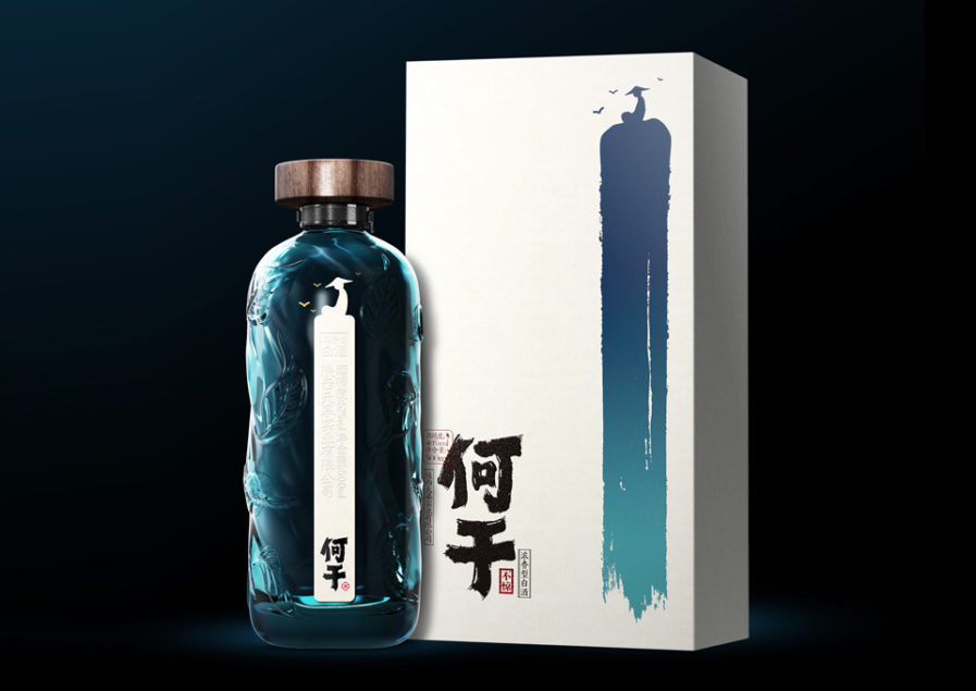
For the Graphis Packaging 10 competition, Chinese design agency, ShenZhen Lingyun Creative, submits their above liquor bottle design titled “Hegan.” Designer Xiongbo Deng wanted the meaning of ‘He Gan’ to be present; “No matter what is happening outside, it does not affect my mind.” With this, they create a design that promotes independent thinking and a calming atmosphere one may not be able to find when engaging in group drinking.

The packaging achieves this with cool colors, such as blues and greens, and a unique bottle embossed with leaves, and water ripples. The product’s combined elements also allow for a visually-impressive design that incorporates Chinese culture and allows locals to feel at peace while drinking alone.
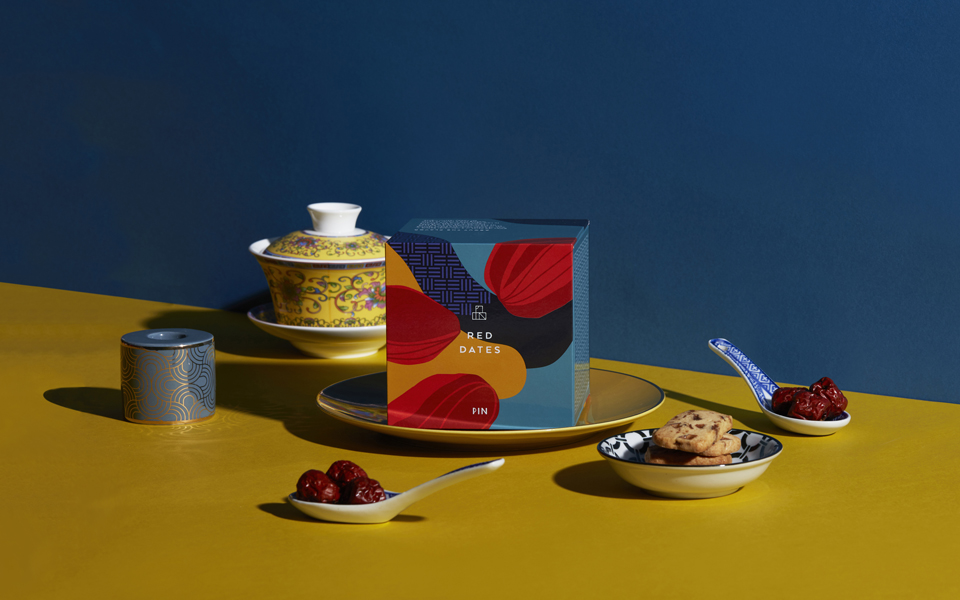
From Hong Kong, Ruth Chao Studio has submitted their designs “Something to Savour” (above) made for their client the Chinese cookie brand, PIN. The name plays on the meaning of PIN, which in Chinese, means “to savor.” Designed by Magdalene Lam and Jack Tai, Ruth Chao Studio presents branding that utilizes a cube motif. From the logo to the boxed packaging, the character for the word PIN, ‘品’, can be seen throughout the concept. When packaged together, the boxes of cookies are stacked like a pyramid to resemble ‘品’.

Ruth Chao Studio is a consistent Silver and Gold winner in our Design Annuals, previously winning Gold in the Design Annual 2019. With their entry, Ruth Chao Studio successfully creates a brand identity that is memorable and can be easily associated with their client.

Enter the Packaging 10 competition now! ENTER HERE.

Author: Graphis

Leave a Reply

Your email address will not be published. Required fields are marked *