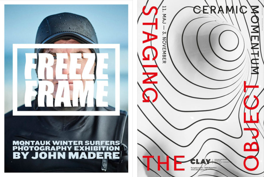
For the Poster Annual 2021 competition, U.S. designer Lynda Decker designs a poster for a photography exhibition dedicated to winter surfers. Entitled “Montauk Winter Surfers Photography Exhibition” (above, left), the poster features a photo taken by Graphis Master John Madere. It advertises an exhibition of Madere’s portraits that he took as surfers emerged from the cold waters in Montauk. Decker’s creative type for ‘Freeze Frame’ accurately suggests that very feeling of cold that the surfers must have felt.
U.K-based design firm A2/SW/HK submit their entry titled, “Staging the Object – Copenhagen Ceramics” (above, right). The design serves as a visual identity for a ceramic exhibition in Denmark. At first glance, the poster doesn’t scream ceramics, but the swirled pattern and the raise in elevation at the center, is reminiscent of clay on a pottery wheel. A2/SW/HK successfully presents their imagery for the museum exhibit.
