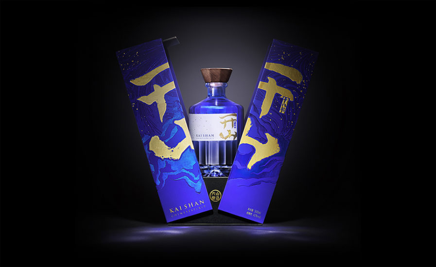
For the Packaging 10 competition, designer Jansword Zhu from China submits their entry titled “KAISHAN 18 Chinese Spirit” (above). In the five-part series, Zhu designs liquor bottles that aim to express high-end luxury. The work incorporates traditional Chinese elements such as the wooden stopper, the mountain inside the base of the bottle, and the pattern on the box inspired by Dunhuang cave paintings. The box is created to open down the middle and complements the blue tint of the bottle. The gold of the written script gives the packaging an overall elegant look. Jansword Zhu designs sophisticated wine packaging that ties in with the brand’s spirit.
