Our New Talent 2023 competition is open and accepting entries, and these latest submissions are a blend of traditional Chinese culture with modern design sensibilities, created by a group of new student designers.
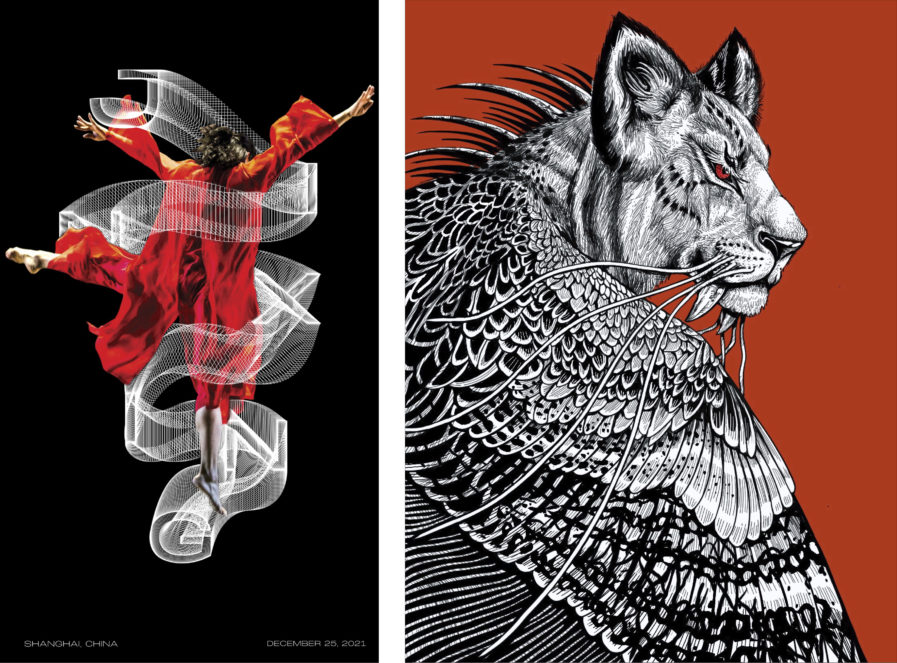
Jingxin Xu, a junior graphic design student from the School of Visual Arts in New York, starts us off with “JIN XING DANCE COMPANY BRANDING” (above, left), a branding design concept for the Jin Xing Dance Theatre, China’s first and foremost leading contemporary dance company. Within its fifteen years of operation, the Jin Xing Dance Theatre has performed in roughly 20 countries spanning four continents and has captivated audiences with its mix of Western and Chinese contemporary dance. Xu has captured the theater’s reputation for artistic excellence through her focus on rhythm and softness to showcase both the grace and suppleness of the dancers. The font is simple but bold, and the curves connecting the letters emulate the fabrics used in the costumes. Xu’s prominent use of red also not only represents the color of China, where red symbolizes good luck, but also calls to mind the intensity and passion shown in the theater’s performances.
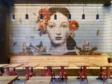
Next up is an illustration design final from ArtCenter College of Design student Lauren Chen. Named after the creature found in Chinese myth, “Qiong Qi” (above, right) depicts one of the Four Fearsome Beasts detailed in the Shan Hai Jing, or the Classic of Mountains and Rivers. In the story, the Qiong Qi is described as a tiger with wings who enjoys eating people, particularly those who are good and just. In her own depiction of the beast, Chen drew it to have reptile-like spines and the fangs of a saber tooth tiger to further illustrate its vicious and evil nature. The detailed monochrome linework works to bring attention to the power of the subject, with the red being used to accentuate both the lines in the background and the piercing gaze of the subject’s eye.


