There’s a universal truth in advertising: genuine experiences drive genuine connections. Rising stars like Ryan Garret Conner, from Syracuse University’s Newhouse School, remind us of the magic that unfolds when creativity meets authenticity. Conner demonstrates the power of combining real-life insights with innovative design for his “Once is Enough” campaign for TUMS. With the mentorship of Professors Mel White and Kevin O’Neill, this class project evolved into a fusion of relatability and creative excellence. Experience Ryan’s breakthrough campaign as he takes you through its many layers and shares his story in his own words below.
By: Ryan Garret Conner
When I first got to work on this campaign, there wasn’t much of a specific brief. I just had to make a campaign for TUMS, and I basically set my own goals for what I wanted to accomplish with the finished product. Just from talking with people in the industry, I learned pretty quickly that it’s sort of easy to just do what’s always been done and what’s expected—but that’s never the work that’s going to make headlines. That being said, I always set out to do something different. I also always try to come up with a visual that doesn’t lean on having to show the product itself. It opens you up to be a lot more creative.
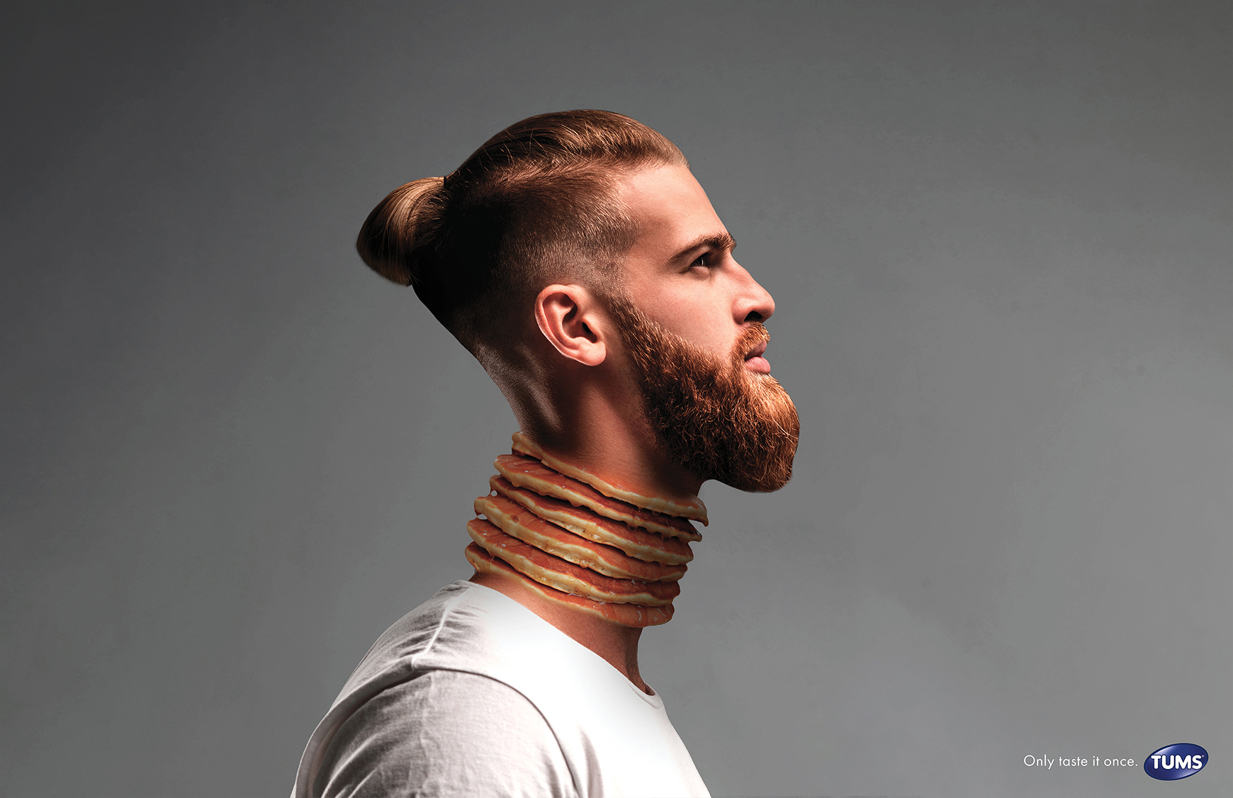
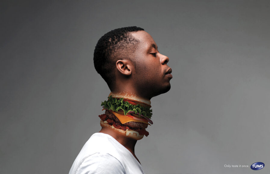
I think as a general rule it helps to know what you’re talking about before you make an ad, and if you don’t know, to do some research. Luckily for me, I deal with indigestion and use TUMS all the time (not actually very lucky), so I came prepared. If you’ve dealt with it, you know what it feels like — and that experience is what I wanted to capture in the visual. A product like TUMS is pretty boring and that can very easily lead to a straight, boring visual, so I decided to just go over-the-top with it first and dial it back if I needed to.
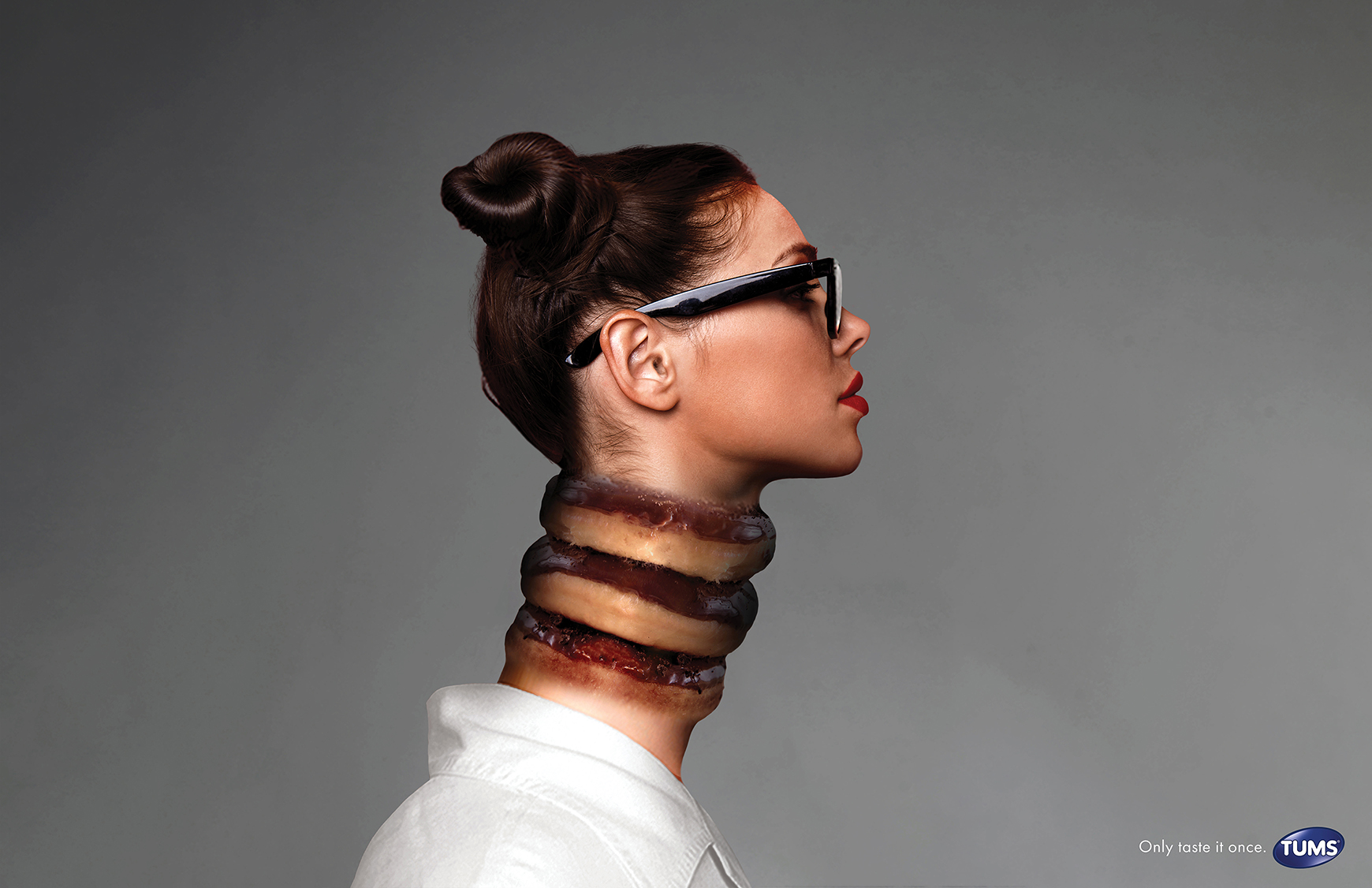
The idea to represent reflux by swapping the neck out for greasy food was actually one of the very first things I sketched, and I ditched it to explore other options for a while. I landed on something that was sort of diluted and ‘eh,’ and when I showed it to my professor, she asked to see some of my original concepting. As soon as she saw that first sketch with a cheeseburger replacing a dude’s throat, she said, “What are you doing? That’s it. Make that.” I guess that was a lesson to trust my instincts more. I started developing the idea and really refining the visual — and for as simple as it is, it actually ended up being one of the most difficult ads to make. Sometimes it’s harder to do something simple because there’s no fluff or distraction. That one core, simple visual has to be perfect or the whole thing is off — so it was key that I nailed the effect I was going for. Color and tone and shadows and proportions were all things that went into bringing it alive, and it took work to get it just right — but I’m super happy with how it came out. I think it captures the silent, painful struggle that TUMS users go through in a way that’s out-of-the-box for the brand but works.
Ryan Garret Conner is an art director and graphic designer from Delaware. He started designing and learning the Adobe Creative Suite in high school, where he won his first competition and represented his school at a national level. From there, Ryan pursued a degree in creative advertising with an art direction emphasis in Newhouse at Syracuse University, where he created campaigns for a variety of brands — including TUMS, Volvo, Tide, and more. He’s had the opportunity to work at Red Tettemer O’Connell + Partners in Philadelphia, as well as Cartwright in Venice, California this past summer. When he’s not making ads, he’s designing cover art for albums or pursuing his interests in fashion and emerging tech.
Social: Instagram, LinkedIn


