In poster design, only a few masters wield their craft with as much prowess and finesse as Graphis Master Stephan Bundi. Drawing from the rich Swiss tradition of graphic design, he seamlessly combines ideation, formal layout, craftsmanship, and typography into unified, powerful visual statements. Bundi shares his creative process behind two award-winning posters for the Theater Orchester Biel Solothurn: “Falstaff” and “Dear Elena Sergeyevna.” Learn how a comedy by Shakespeare and the story of treacherous schoolchildren were distilled into two gripping designs, each reflecting the essence and the intrigue of their narratives.
By: Stephan Bundi
Falstaff (After Shakespeare)
Regarding the content: “Falstaff” is a comedy by William Shakespeare that follows the adventures of the overweight and drink-loving Sir John Falstaff as he attempts to seduce wealthy ladies and weave intrigues. The plot revolves around deception, cunning, and a satirical portrayal of society and power.
For a poster, it is crucial to visually represent the central elements comprehensively and intelligibly. Excessive alcohol consumption is symbolized by the swaying bottle, while the ample bottle shape alludes to the obese main character. Since it is a comedy, the object—the bottle and its form—is exaggerated. The execution lies in the tension between a realistic and a graphically reduced representation.
Even with this poster, the design must take into account the theater’s corporate design. The arrangement and color scheme of the logo are adapted to the color mood of the motif. A functional corporate design should establish constants and allow room for variability. The design should not be constrained by a rigid corporate design; a variable typography system is better suited to ensure the theater’s recognition.
Liebe Jelena Sergejewna (Dear Elena Sergeevna)
Successful communication design begins with gathering information about the project, in this case, the play “Dear Elena Sergeevna.”
Regarding the play’s content, schoolgirls and schoolboys visit their teacher to wish her a happy birthday, but with a treacherous intention to extort the key to Sergeevna’s safe. Their goal is to swap the math papers in the safe to achieve better final grades. The play provides insight into the depths of humanity and inhumanity.
The key plays a central role and is prominently highlighted in the design. It is depicted as a reversible figure, with a screaming red face becoming visible in the negative space. This transforms a simple object into a menacing signal.
Effective poster design has always aimed to create clear, concise images that can be quickly grasped and understood. An idea may be correct but can lose its power in visualization and fail to achieve the desired impact. Therefore, visual design is an ongoing process that requires translating thought into action, reassessing, and reworking. The optimal solution is achieved when working independently. Hence, gathering information from the author, director, and dramaturge beforehand is crucial, followed by developing the visual concept independently.
The theater’s corporate design dictates the use of Helvetica capital letters in three font sizes for all titles. The rare German letter combinations EJ, LJ, and AJ required a special solution for this title to prevent excessive spacing. Therefore, in some cases, the “J” was extended so that its curve fell below the preceding letters.
In accordance with the Swiss tradition of graphic design, I do not separate the ideation, formal design, craftsmanship, and typography because they mutually influence each other. In working for a theater, one must pay attention to the advertising mix, including advertisements, web banners, program titles, promotional flyers, and more.
The goal is to create a fitting, distinctive visual identity for each play, an identity that can be categorized and understood under the theater’s brand (TOBS).
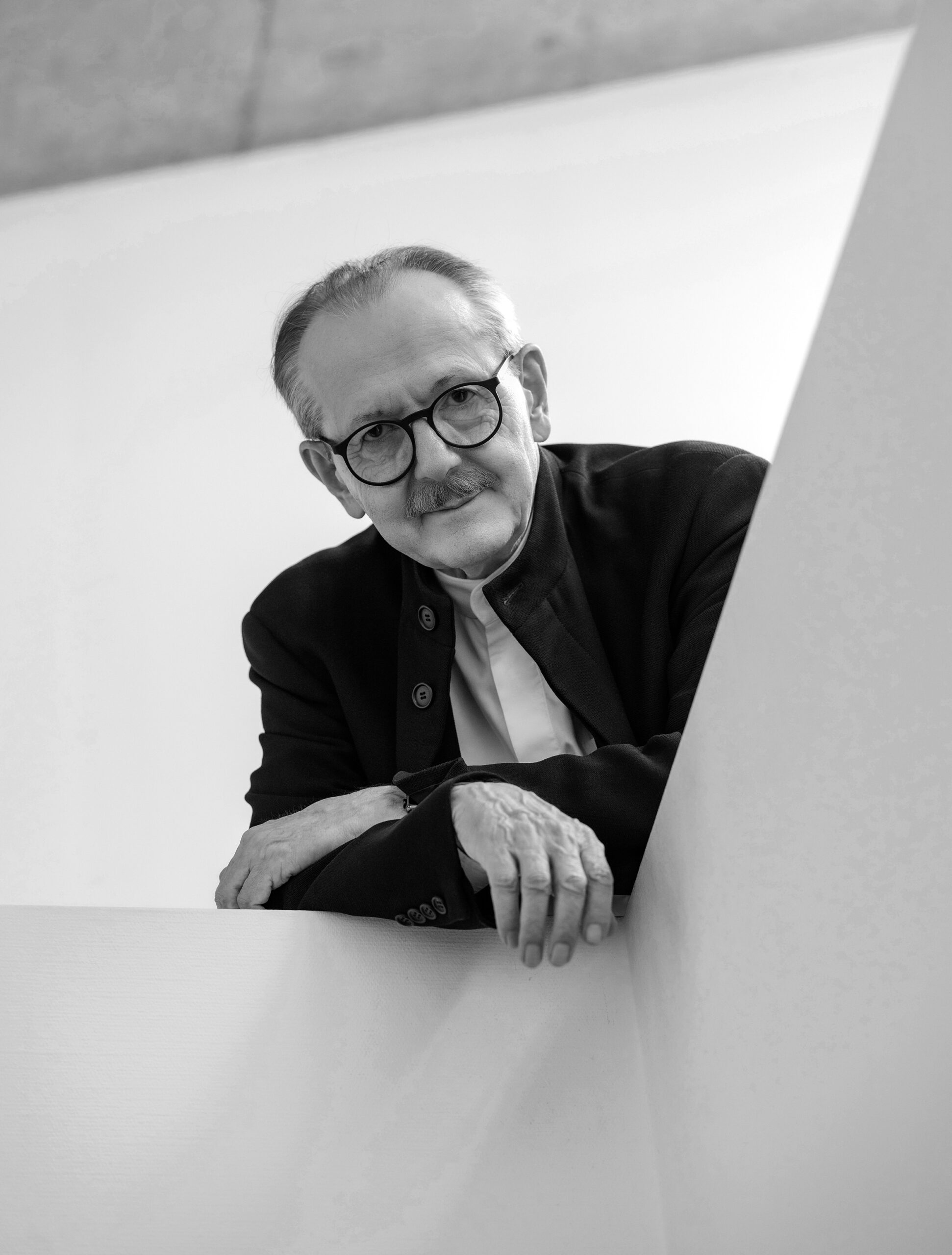
After completing his graphic design studies in Switzerland at the State Academy of Fine Arts in Stuttgart, Stephan Bundi founded his own studio. As a designer and art director, he works for film producers, concert organizers, museums, theaters, publishers, and in corporate and institutional branding. He combines unconventional ideas with the practical Swiss design tradition. In realizing his projects, he selects the most suitable representation technique to best convey the intended message, whether it’s typography, illustration, painting, or photography. He views successful design as a process where thinking, designing, and rethinking continuously alternate until the final print-ready version is achieved. He has received several awards at international design biennales.
Social: Instagram