New Stand-Out Packaging Entries from Jan Vana (SE) and Praktis Design (TT)!

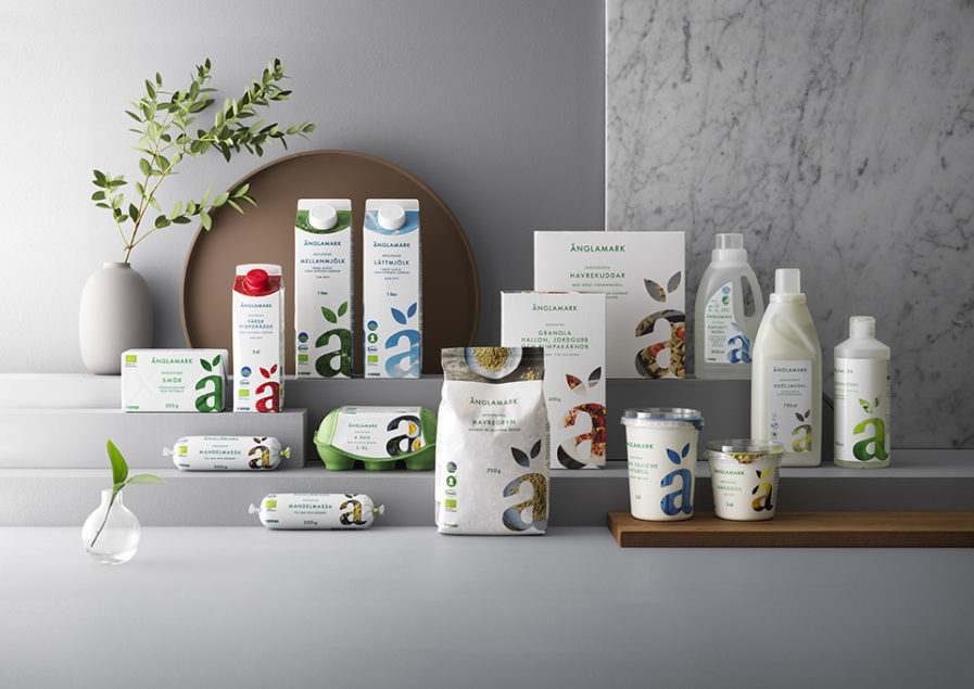
For the Graphis Packaging 10, Swedish design firm Priority and designer Jan Vana, created the above packaging design for Änglamark, one of Sweden’s most sustainable food brands. The company develops a variety of items including detergent, dairy products, and fresh herbs. The challenge was to create a design across their range of products that would strengthen its relationship to specific target groups, primarily the next generation of consumers including families with children under the age of 30. 

The new design breathes “modernity, attitude, transparency, and differentiation.” The white color allows the packaging to stand out on the shelf for a competitive edge. Priority also utilizes a clear ä that has been taken from the previous logotype and is more prominent in the new design. Jan Vana helps create packaging that strengthens its brand recognition.
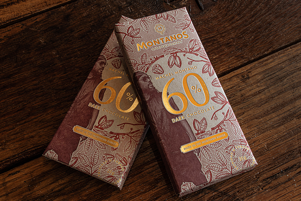
Praktis Design from Trinidad and Tobago created a new look for the Montanos’ 60% Dark Chocolate bar packaging. Pracktis develops the design with inspiration from the Trinidadian Carnival and Machel Montano’s role in it, tying in Machel’s persona and spiritual interests, and eastern visuals with design elements that can be seen in Trinidad’s Carnival.

The design of the box itself has a luxurious feel and was influenced by the need to give the smaller bar greater presence. They were inspired by the packaging design of a fine single malt scotch; the way it’s nestled into an inner bracket of its own makes it feel well presented and protected. The designers also referenced the lotus flower and used a closing mechanism that will allow it to stay firmly closed on its own. Montanos’ chocolate bar enters the international dark chocolate market in a glamorous fashion.

Submit your best Packaging designs to the Packaging 10!

Author: Graphis

Leave a Reply

Your email address will not be published. Required fields are marked *