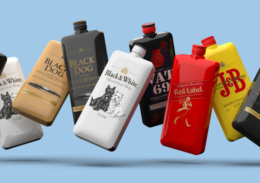
For the Packaging 10 competition, LOVE Creative from the United Kingdom submits their entry titled “The Hipster” (above). Designers Nick Johnson and Paul Shipley wanted to help Scotch drinks appeal to a younger demographic for Diageo India. They shifted the brand image of a liquor seen only for older people with clunky packaging, to a fresh reinvention called ‘The Hipster.’ Instead of being a long clear glass bottle, the bottle has become condensed to flask size and is inspired by the shape of a smartphone. The design became flexible to the needs and wants of a younger demographic, and gives off a light-hearted, portable, and fun atmosphere for the product.
