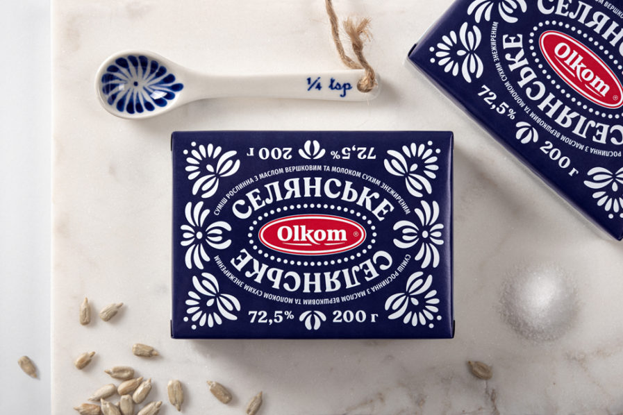
Canadian designer Yurko Gutsulyak finds folk art inspirational for his food spread packaging for Olkom, while South Korean agency BRAND DIRECTORS lights up promotional packages for credit card service company KB Kookmin Card.
In Ukraine, food spreads are stigmatized thanks to contrary media information and a market full of low quality “fake butter.” Olkom is changing those perceptions, starting with its packaging for “Olkom Spread.” Gutsulyak combined a “milky” countryside aesthetic with a modern take on Ukrainian folk crafts for a cross-cultural look. Throw in a blue color palette not typical for spreads, and you have some standout, innovative packaging.
