AV Print’s Poster Series Evokes Downton Abbey’s Golden Age

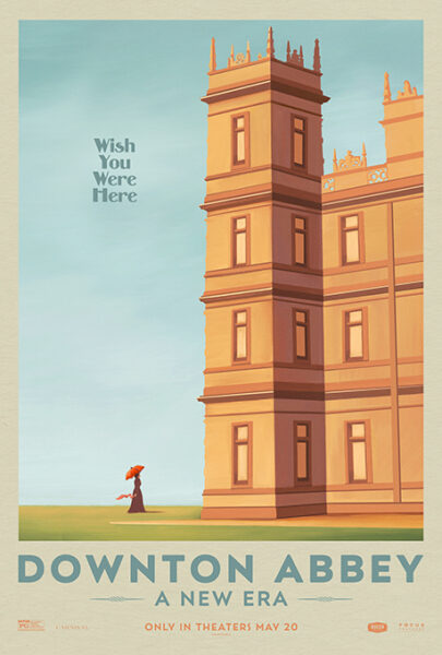
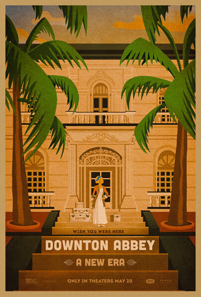
Today’s blog shines the spotlight on AV Print, whose key art is a visual narrative as compelling as the storylines of their subject, Downton Abbey: A New Era. Their collaboration with Focus Features earned them a Platinum award for their illustrated travel poster series that captures 1920s elegance and its timeless allure. Guided by creative director Brian Lauzon and VP Peter Stark, the posters transport onlookers to the opulent age of Downton Abbey, offering an invitation into its grandeur via a rich mosaic of visuals that pay homage to a bygone era.

By: Andie Hughes

At AV Print, we’ve had the incredible opportunity to work on some very high-profile jobs with Focus Features and Downton Abbey: A New Era, one of our first major theatrical projects since our inception as a division of AV Squad. Our creative director on the project, Brian Lauzon, in coordination with our VP and Head of Print, Peter Stark, helped guide our artists through this journey with the Focus clients. The Downton Abbey posters, both for its television seasons and its first film, have always been challenging due to the sheer number of people creatives needed to fit into a single image. Jumping into the release of the second theatrical installment presented AV Print with the chance to see what new life we could bring to such an established brand, knowing that we’d be able to push and break the mold a bit, perhaps even more than the first film was able to.

Therefore, we got straight to work bringing our thoughts to life for the various buckets of creative we knew the client was looking for, including trying to solve what we affectionately call “people puzzles.” Our initial talks with the client brought out some stunning ideas in our first rounds, but we kept coming back to the biggest thing that set this film apart from its

television run and first film predecessors: the fact that we got to leave the Abbey. The cast we rarely saw leave the castle grounds was going to be crossing oceans! To France in the 1920s, no less! A new era indeed…

Throughout our creative rounds, we played with many photographic solves—teaser and payoffs alike—which were ultimately finished as part of the larger campaign for the film in coordination with pieces from several other agencies. Even with the success of those pieces, what excited us most was our travel poster series. Vintage travel posters are often a source of

inspiration to designers; they’re pulled as references time and time again to evoke nostalgia, idealism, and dreams of far-off places. We included a few concepts in this style in early rounds to see if it was a direction the client would bite on, and bite they did! The early iterations were immediately LOVED but would never work as the main key art for the film. Yet, there was no doubt that these pieces could live online or as specialty prints to round out the campaign.

So, we got the green light to devote significant resources to bringing to life these complex illustrations that were authentic to the style of the film’s “new era.” Our creative team helped select references from the film’s unit photography to create rough layouts before setting the illustrators loose to work their magic. Our staff illustrator, Ben Garriga, got the majority of these over the finish line. He took the photographic layouts and created these

beautiful pieces of art that breathed life through every revision. Thanks to his attention to detail, you can feel the breeze, smell the ocean, and feel like you’re stepping into a French Villa of your own. We also brought in a freelance illustrator, Katie Hearns, to kickstart the piece highlighting the Abbey itself. Additionally, our creative director stepped up to the plate to dial in the type design. Type sets illustrations of this style and period apart; without the bespoke text to fit each image, these pieces would not have been elevated to a level that garners such recognition.

All of us here at AV Print were incredibly thankful to be involved in the project and are overwhelmingly grateful for the love these pieces have received from audiences. Opportunities to create original and beautiful homages to iconic art styles don’t come around all the time, and we couldn’t be happier with how this series turned out.


AV Squad is a creative advertising agency specializing in entertainment marketing. Founded by Chad Miller and Seth Gaven in 2004, AV Squad has grown into one of the leaders in the entertainment marketing space, garnering numerous awards for campaigns that span all genres, audiences, and budgets. Fostering a culture of collaboration, respect, creativity, and diversity, AV Squad’s work speaks for itself. In 2019, Peter Stark joined the team, adding a new division AV Print, to handle all key art, illustration, design, and OOH capabilities. Together, these teams continuously collaborate to create outstanding, attention-grabbing campaigns that stand out in the busy media landscape.

AV Squad hails independent artistic expression while also embracing audience, client, and creator feedback to build some of the finest and most impactful advertising creative imaginable. Every client is a creative partner on a shared mission to produce successful marketing campaigns that garner industry acclaim and yield commercial success. We are proud to employ some of the most talented designers, editors, artists, and illustrators in the industry. It’s difficult to not encounter a piece of creative that this agency has produced. Be it trailers and key art across theaters, billboards around any major city, or the numerous TV and digital spots, AV Squad is proud to help share the delight and excitement of entertainment with the world.

Social: Instagram, X, LinkedIn, Facebook


Discover more award-winning Design 2024 entries here.

Author: Graphis