Above the Tides: Hoyne’s Narrative for Isle Waterfront Newstead

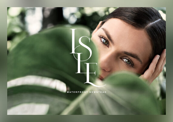
Australian agency Hoyne has masterfully created a brand identity for Mirvac’s Isle Waterfront Newstead that embodies the essence of a private retreat set alongside an urban backdrop. With the name “Isle” evoking an intimate sanctuary, the creative weaves a narrative of balance and tranquil luxury. The visuals articulate the development’s unique position as a serene escape in the sky, offering a life in perfect harmony with the surrounding Brisbane River.

By: Jillian Clinch & Elliott Pearson

Create a resort in the sky — this was the design inspiration behind Australian property group Mirvac’s newest apartment development on the Brisbane riverfront. Hoyne brought this vision to life with a dream-like yet highly refined brand identity.

Established in 2001, Mirvac’s decades-long Waterfront development has been a catalyst for the evolution of Newstead — reshaping this once-industrial suburb into one of Brisbane’s most popular precincts. With four apartment buildings already delivered and more to come, we were briefed on Waterfront Newstead’s next chapter: a 25-story building with one to four-bedroom premium apartments.

Designed with a north-facing aspect for optimal views over Brisbane River, this residence featured a wealth of resort-like amenities spanning from ground plane to rooftop. Knowing that most purchasers would be living in the building rather than investors, we recognized the importance of capturing Waterfront Newstead’s diverse, enriching lifestyle experiences. 

The unifying idea behind our brand identity became ‘a life in balance’: offering a place both vibrant and tranquil, social and private, relaxed and sophisticated.

For this residence, we wanted a name that felt boutique and intimate. Meaning ‘small island’, the name Isle is bold, simple, and unexpected for a building. It evokes a self-contained world and sanctuary that is lush, luxurious, and connected to nature. 

With our name and the architectural vision of creating a resort in the sky, the Isle brand captured the experience of a hidden retreat. We did not want the Isle to oversell itself but instead take its time in being discovered, revealing layers and immersing our audience in sensory, mirage-like moments of life. Visual storytelling was key, using dreamy and refined photography that portrayed the beauty of Isle coming into focus. A first-person poetic narrative allowed us to layer these visuals with thoughts and emotions, giving its highly aspirational nature a grounded human touch.

It was important for Isle to stand out — not only among a market of competitors relying on the same visuals and language, but also within the Waterfront master brand and precinct. Our brand identity did just this; seamlessly fitting in with a family of residential buildings, while reaching skyward to offer a mesmerizing new pinnacle in apartment living.


VIC. NSW. QLD. Hoyne’s expansive roof covers three states and an in-house team of 50 industry experts: strategists; creatives; CGI artists; dreamers; copywriters; digital and UI interface designers; makers; account managers; super-sleuths, marketers, and production. Our wealth of insights, vision, and experience are why clients consult with us, first and foremost.

We’re for MORE. More challenges and opportunities. More leading the way and raising the bar. More in-depth insights and ground-breaking results. More heart. More substance. More making a difference and leaving a legacy. Because great things are made from MORE. That’s why we make the most of it every day.

Boutique and institutional. Local and international. Private sector and government. Our clients are diverse and driven. And yet we all share the one goal: to add value and create places where everyone prospers. Together.

Social: Instagram, LinkedIn, Facebook, X


Discover more award-winning Poster 2024 entries here.

Author: Graphis