Contrasting Photo Analysis + M is for Museum: Newest Design 2023 Entries

Less is more! These Design Annual 2023 submissions show us how using clean, modern, and minimalist aesthetics can still produce striking and creative designs, setting any brand or product apart from the crowd.

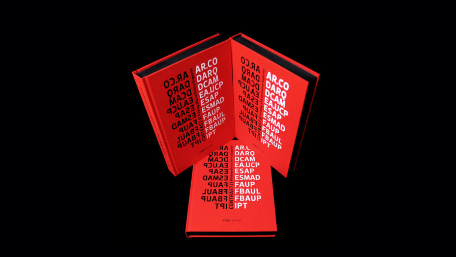
First up is “CONTRAST II – A Fotografia no Ensino Superior” (above), a book cover design by Né S. Design for the Portuguese publishing house, Cityscopio – Scopio Editions. Their book (translated as Contrast: Photography in Higher Education) is a collection of reflections and critical analyses about photographic projects made in the contexts of education and research conducted by various institutions. The variety of projects led by this initiative promotes a deeper understanding of the photographic world and its potential for allowing people to perceive reality in new ways. For the book cover, designer Artur Leão wanted to embody the “vibrant interaction between teachers and students,” as well as the academic collaboration between the institutions, through the book cover’s rich red color, which allows the institution’s names to stand out on the cover in bold black and white font. As a multidisciplinary artistic network project, CONTRAST also offers an online platform that aims to “disseminate the photographic projects as well as explore the potential of video, audio, and even the digital format of the book as tools to demonstrate its interdisciplinary nature.”
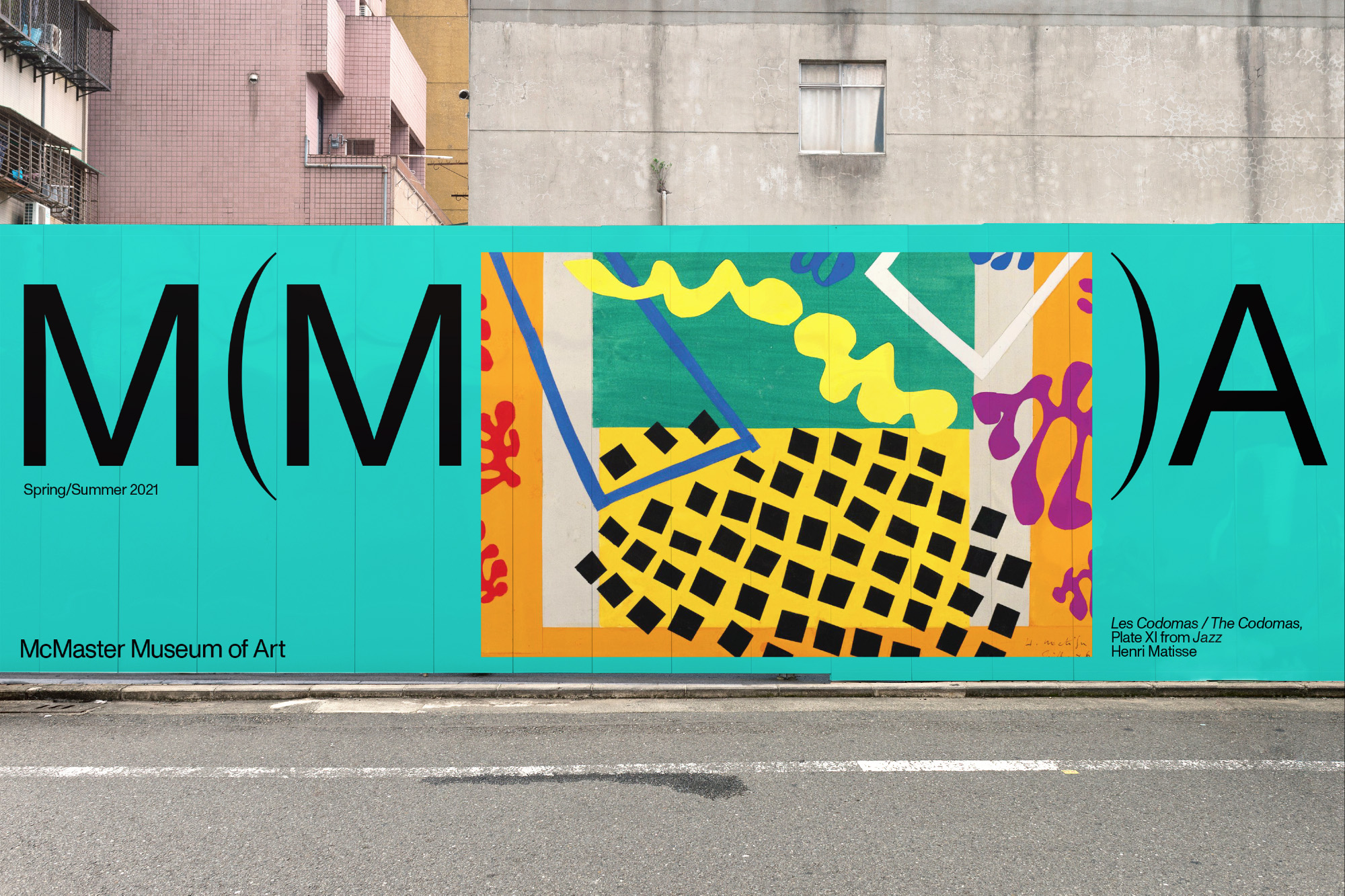
The “McMaster Museum of Art Identity” (above) was designed for the McMaster Museum of Art, a public gallery in the heart of the McMaster University Campus in Hamilton, Canada. Housing a diverse collection of artwork, artist files, and exhibition catalogs, the museum aims to disrupt the traditional museological narrative by creating a more inclusive relationship between people and artistic practices. Seeking to communicate this through their brand, the museum approached the Toronto-based strategic branding and design agency Underline Studio for a new visual identity. The rebrand, which launched in 2021, features a modern logotype and a branding system that is centered around the “M  for Museum” set in parentheses. As the agency explains, these symbols are commonly put around a word to show a remark or passage that departs from the theme of discourse, aligning with the Museum’s vision to depart from convention. The parentheses in the logo also permits different applications, allowing the inclusion of artworks that are displayed in the museum’s exhibits. To ensure the new museum brand would stand out, Underline Studio utilized a vivid color pallet to work as a backdrop across a range of promotional materials, including brochures, posters, stationery, and a website. With its strategic use of typography, color, and graphics, the museum’s new brand identity is a dynamic and bold affirmation of its commitment to diverse art and talent.   

To see more stunning designs, or learn how to submit your own work, visit graphis.com!

Author: Graphis