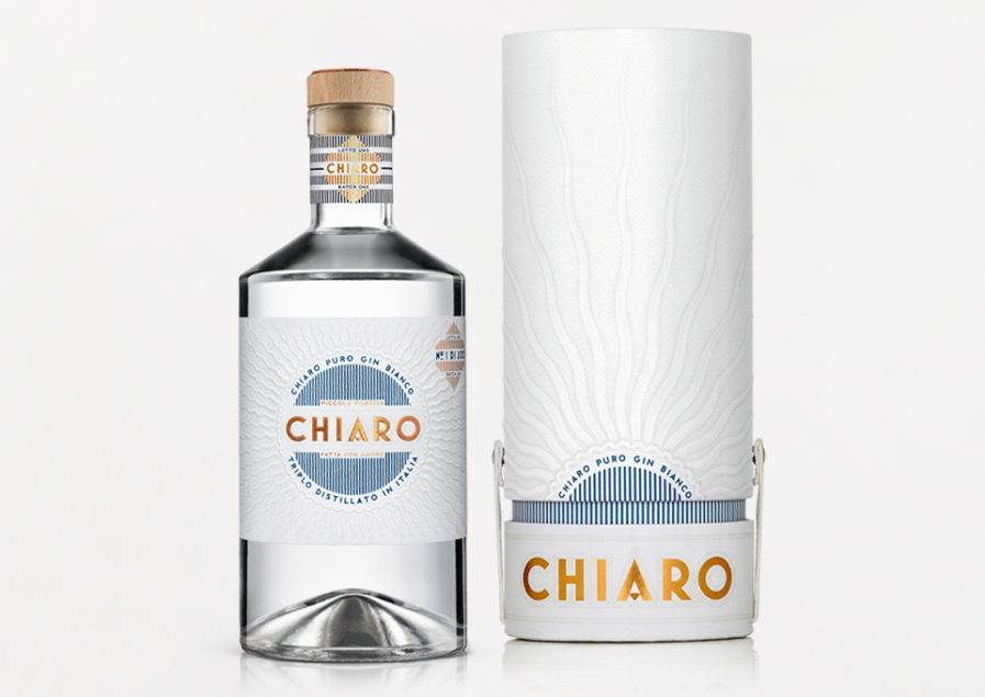
The Graphis Packaging 10 has some new submissions. Submitted from Australia, the Harcus Design Agency has entered their design “Chiaro.” Spicers Wine had a new product that they wanted packaging for that would be able to stand alone. The paper used for the labels and neck wraps is an ultra white cotton paper stock called Spicers Cotone Extra Bianco Ultra.
The quality of the paper and its embossing are shown through the image of the sun, and how bright the white is. Harcus Design created packaging that utilizes these qualities of the paper to tie it in with the clear white gin, including the name Chiaro which means bright and luminous. Harcus Design previously won Gold in the Design Annual 2020.
