
ABOVE — Polypod (Beirut, Lebanon) for Fouad Samara Architects | Designers: Hani Asfour and Hayat Sheikh | Web Developer: Hadi Abou Reslan | GOLD AWARD
IN THEIR OWN WORDS:
“In response to the Modernist, brutalist ethic that underlies the studio’s philosophy, the redesigned logo for Fouad Samara Architects is always the same exact size and location on all applications. The system allows a seamless approach for scalability and additional applications.
The saturated yellow color, associated with construction machinery, fast cars, and high-end design products helps the brand stand out in a market dominated by grays. Application extends to brand collateral including business cards, letterhead, envelopes, design portfolio, CD covers, construction site, and signage in addition to web design and development.”
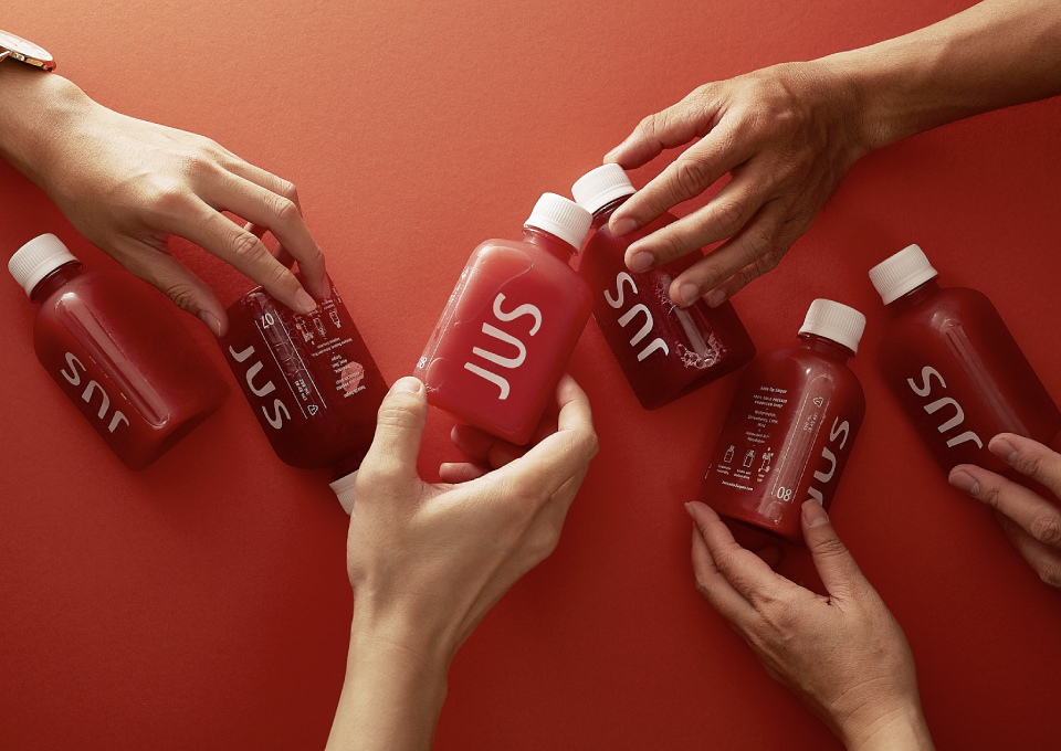
ABOVE — M — N Associates (Ho Chi Minh City, Vietnam) for JUS | Designer: Duy — N | Photographers: Hau Le, Dion Nguyen, and Monkey Minh | Production Partners: Tú Anh Printing Boutique and Cropmarks | Project Manager: M — Lan | Photographer’s Assistant: Lam Minh Trung | Stylist: Ben Pham
IN THEIR OWN WORDS:
“Juice Up Saigon is a raw, cold-pressed juice company. Founded in Sep 2015 by three people sharing the same love for a healthy life, their journey starts from Saigon, one of the most busiest city in Southeast Asia. Juice Up Saigon offers a simple, delicious way to integrate plant-based health into a busy life because they believe that nutritious and delicious juices could be made practical and ready for everybody.
Our mission is researching and finding the right solution both in terms of visual identity as well as art direction to create an unique sustainable cold pressed juice brand in Vietnam. Cold-pressed juice is a complete new product in Vietnam — JUS, or Juice Up Saigon, is the pioneer to break the barrier — and so the challenge is huge.
Based on the concept of equilateral triangle of yoga that connects body, spirit, and mind together we created a unique equilateral triangle bottle shape.
The JUS logo was designed with minimalism in mind. A white color scheme contrasts with the vintage French architecture dominating Saigon while curves and unbalanced weight-arms create the naturalistic visual identity for the organic foods brand.
With the greenhouse-inspired concept, the atmosphere of an organic farm is recreated. Friendly light colors and woodsy accents make customers feel at ease while enjoying JUS. As a result, JUS is now one of the best-selling cold-pressed juice brands in Vietnam.”


