The Delta Diner, a unique stainless steel marvel nestled in the woods of northwestern Wisconsin, is renowned for its retro charm and unforgettable comfort food. Its nostalgic 1940s roadside diner glow attracts patrons from miles away. Traction Factory, the creative team behind the Delta Diner’s retro product packaging and marketing campaign, has successfully captured this unique selling point. Under the guidance of design director David Brown, the team crafted a visual identity that seamlessly blends the diner’s mid-century vibe with modern-day retail allure. Their playful yet meticulous approach turned hot sauces, coffee, and spicy pickled garlic into must-have take-homes while maintaining a homespun feel. Celebrating their win in the 2024 Advertising Awards, this project exemplifies the magic that happens when creativity meets commerce.
By: David Brown, Design Director, Traction Factory
An oddity is hidden deep within the forests of northwestern Wisconsin: a gleaming, stainless steel-clad diner. Known for its unrivaled offerings and hospitality, it garners patrons from hundreds of thousands of miles away to eagerly wait hours for a booth simply for the experience of time travel and comfort food.
It’s in this environment that the Delta Diner has allowed us to assist them over the years in developing creative that’s reminiscent of a bygone era––one rich in design, illustration, and engaging copywriting, little nuggets that can transcend today’s blur of digital media.
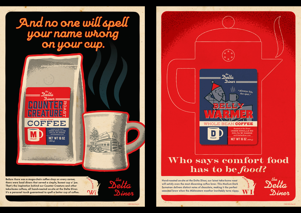
The items shown as part of the poster series were, at the time, only available in the diner and made onsite. Their chief desire was to make these packaged products (hot sauces, coffee, and spicy pickled garlic) available to customers on the way out and in retail markets.
Once we began to work through the opportunities and requirements, we realized that a more thorough examination of their brand would simplify the process of flushing out creative work for the entire campaign. What we started with was, at best, a loose set of guidelines that needed tightening to bring it all under control and avoid the pitfalls of a ‘homespun’ interpretation. While that last point is still relevant in a privately owned diner, bringing a defined visual vocabulary to future marketing efforts meant setting that for the client. Once accomplished, the real work could bring these products to life on shelves.