These new packaging designs bring the best of the past and the future with traditional looks that are changing it up for a brand new audience. Whether it be a new bottle to celebrate and look back on 2021’s Year of the Ox or a commitment to a brand with a whole new line of products, these designs are beautiful, timeless, and definite contenders in this packaging competition.
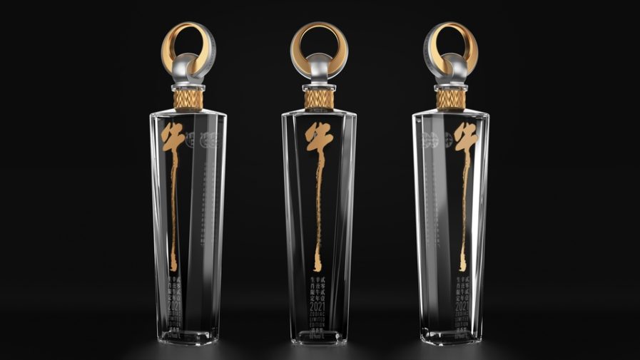
“Niulanshan–Limited Edition for Year of the Ox” (above) was designed by Tiger Pan and Xue Xia of Shenzhen Tigerpan Packaging Design Company for their client Niulanshan. Named for the Chinese character of the ox, Niu, the name “Niulanshan” as a whole means “mountain looking like a golden ox”, which is the perfect description for the lightly flavored Chinese spirit. The packaging design is vastly different from the ones Niulanshan has had in the past, wanting to create a ceremonial edition for this bottle. The glass is much taller than is typical, and is cut straight to give it a stronger and sharper look. The inspiration of the cap comes from the nose of the ox and the nose rings they occasionally have. The abstract shaping of the cap and bottle give it a fun opening experience and strong impression, while the neck, painted with gold and embossment material, depicts textures of ingredients like ear wheat and sorghum. The whole design tells a clear story with its many minimalist elements, and has caused a cultural shift within the brand, making what was seen as a cheap spirit as a more high quality drink.
