One of the primary strategic marketing focuses for any product is it’s packaging design. From form and structure to materials, imagery, and typography, attractive and aesthetically aligned design earns much sought after attention for brands whether on the shelf or online.
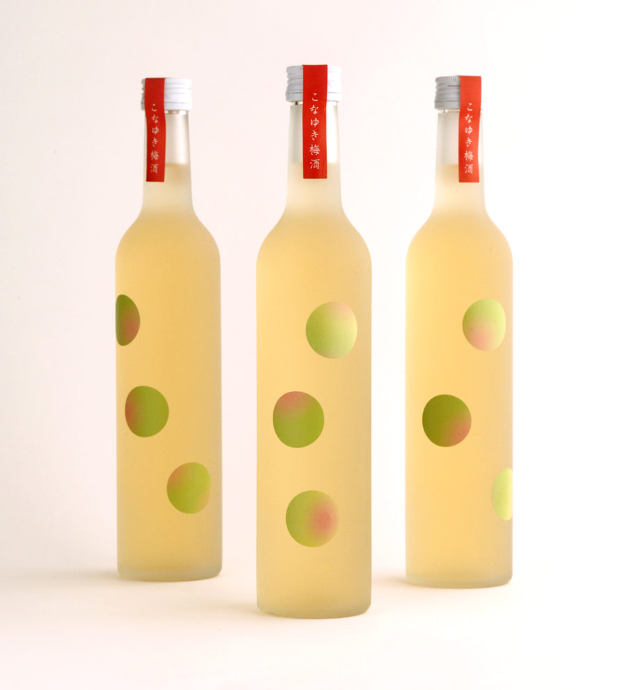
In the Packaging 10 entry from Terashima Design Co. (Japan), designer Masayuki Terashima applied his elegant minimalistic style for client Sapporo Shusei Kogyo’s Konayuki “Plum Wine” (above). Inspired by the shape and sheen of plums, he randomly placed illustrated bubble-like plum stickers on the front of the semi-translucent glass of the wine bottles, giving an illusion of the fruit swimming inside. The playful design is meant to represent the delicious sweet flavor and fun to be had when enjoying the beverage. In their refreshing approach, Terashima’s design stands out on the shelves from rectangular wine labels.
