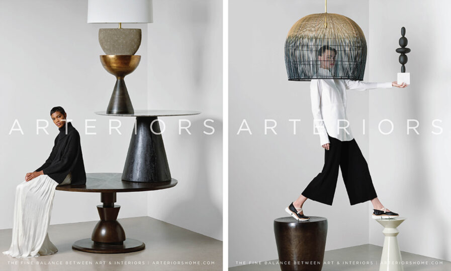
In the ever-evolving advertising world, it’s crucial to have a standout campaign that captures your audience’s attention. Enter Graphis Master Vanderbyl Design‘s winning advertising campaign for “Arteriors,” a captivating campaign that showcases visually stunning images of furniture, lighting, and decorative items inspired by Arteriors’ eclectic aesthetic and strategic goals. With the tagline “A fine balance of art and interiors,” the playful, spirited, and edgy images will capture your attention. Learn how this successful campaign transformed the perception of a long-established furniture company as we explore the concept, execution, and results of this Graphis Advertising 2022 Platinum-winning ad campaign.
About Vanderbyl Design’s winning advertising campaign for Arteriors
By: Michael Vanderbyl
“The images we created for Arteriors Advertising are whimsical but not arbitrary. In fact, the ad campaign had its source in a 360-degree rebranding program that we designed to support the company’s strategic ambitions and the eclectic aesthetic of its furniture, lighting, and accessories.
“Our concept and tagline for the ads—’A fine balance of art and interiors’—was developed in part from the name “Arteriors.” At the same time, we wanted to create something a bit different from the furniture ads one sees in shelter magazines, most of which simply assemble sofas and chairs in a domestic setting. These types of images tend to blend in or get lost with the editorial portion of the publication.
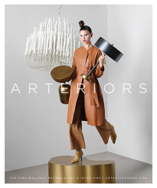
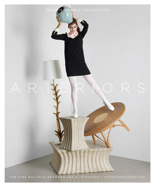
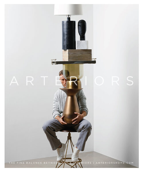
“We worked with photographer Geof Kern to create distinct Surrealistic images that were playful, spirited, and edgy, drawing from the fashion world. Our solution was, quite literally, a balancing act. We solved more than one problem by building up several pieces of furniture juxtaposed with lighting and accessories, we solved more than one problem. We were able to show a number of selections from Arterior’s vast array of products—and to capture consumers’ attention with the lyrical quality of an image in which a “fine balance” of lamps, tables, and decorative items appear to defy the laws of gravity. It’s worth noting that we did not achieve the effect by using Photoshop. The assemblages were built in real-time, making a subtle difference in how each element reacts to the lighting and how one’s eye perceives the image.
“The rebranding program has been very successful and changed the perception of this long-established furniture company.”
More Graphis features from Vanderbyl Design. | Vanderbyl Design‘s website.

