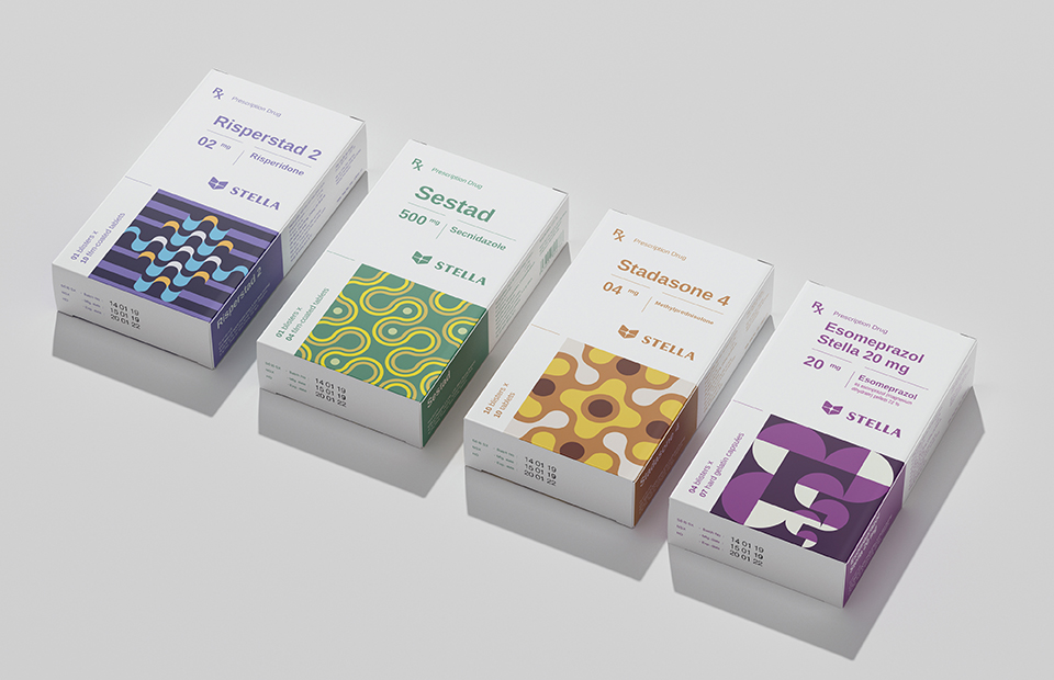
Our new Packaging 10 entries skillfully add personality to seemingly normal objects, such as these can and prescription medicine rebrands. Don’t you wish your refrigerator and medicine cabinet were designed by Pepsi and Bratus?
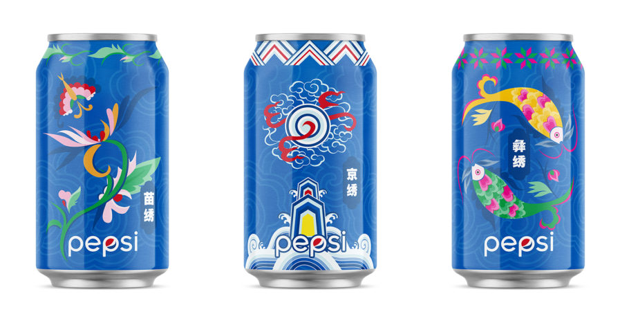
PepsiCo Design & Innovation, once again, perfectly nails another can rebrand. This limited-edition entry titled “Pepsi X MOM HANDWORKS – LTO Can Set” (above) was designed to celebrate the longstanding partnership between Pepsi and the China Women’s Development Foundation’s “MOM HANDWORKS” Cooperative Program. This partnership began in 2019 with the collaborative Bring Happiness Home Chinese New Year Campaign and the launch of this rebrand.
To kick off this campaign, Pepsi and the China Women’s Development Foundation unveiled a scroll created by almost 100 different craftsmen from six different provinces. The scroll contained both traditional and modern designs, embodying different New Year customs from all across China. Furthermore, Pepsi wanted to also mirror MOM HANDWORKS’ Sustainable Development and Innovation Public Welfare Project, which launched in 2016 and promotes protecting cultural heritage and supporting traditional artists, through this redesign. These three cans celebrate Chinese heritage, with the blue background showcasing regional embroidery patterns that don’t take away from the Pepsi brand. It’s no wonder these cans are in contention for the New York Design Awards!
