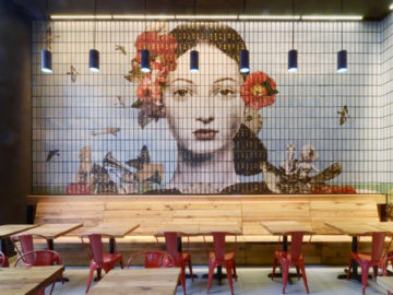
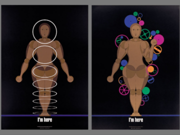
The foretelling poster above won a Gold Award in the Typography3 competition. Designed by Paul Garbett of Garbett Design in Surry Hills, Australia, the poster was created for the Australian Graphic design Association (AGDA) to draw attention to the growing problem of climate change, which is melting the ice and leading us closer to more and more natural catastrophes.
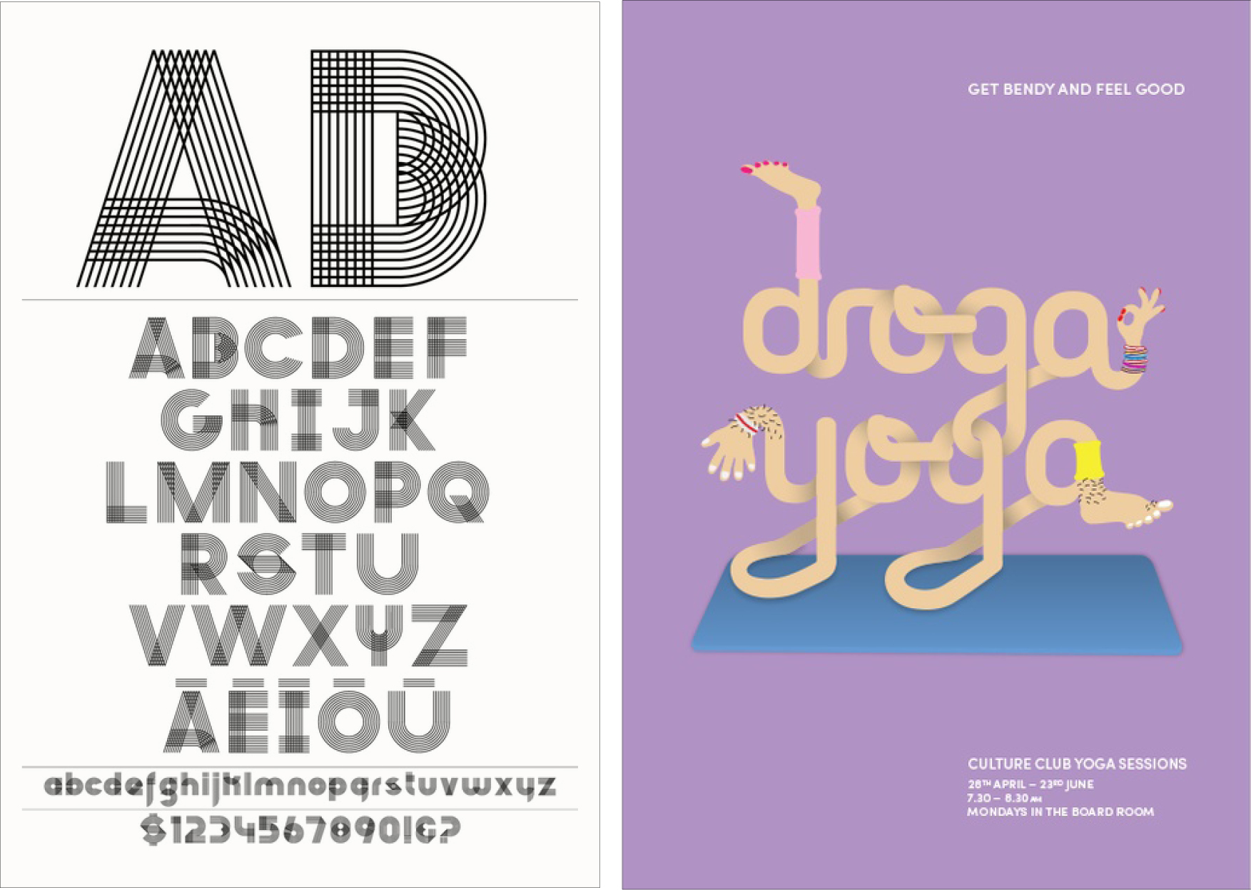
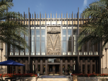
The typeface beside it was designed by Brian Slade of Insight Creative in Wellington, New Zealand, for the NZ Drug Foundation. Their motive was to drive attendance and engagement for the foundation’s new initiative, which included a series of social gatherings and meetings and targeted Maori leaders and communities. “Traditionally, Maori uses combinations of modular cross stitching to embellish various panels and aspects of their meeting houses. This basic grid system informed the type structure and construction. This element representing the strength of the whole, greater than the sum of its parts, each adding to the next. A metaphor for collaborative, positive change for the good of the community.”
