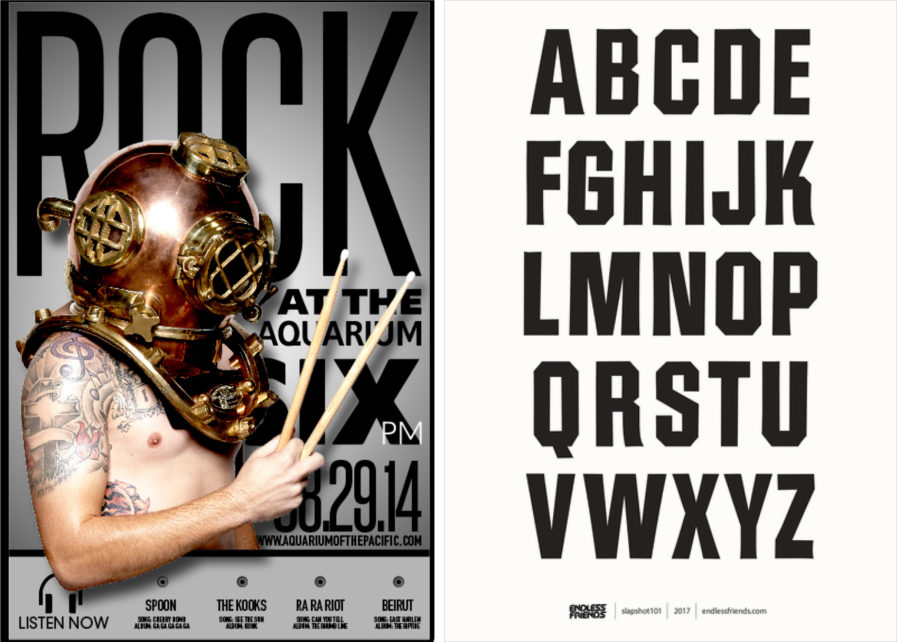
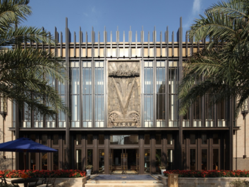
Student Marcus King and Photographer Joy Wong of Art Institute of North Hollywood won a Platinum Award in Typography3 for the above (left) poster design, which promotes the event “Rock at the Aquarium.” In order to draw attention, “each poster had an element of rock and roll combined with aquatic imagery because the venue is the Aquarium of the Pacific.” For added tactility and engagement with the audience, “passersby can engage with the poster by plugging their headphones into any of the outlets on the poster to sample the various songs that will be played at the venue.”
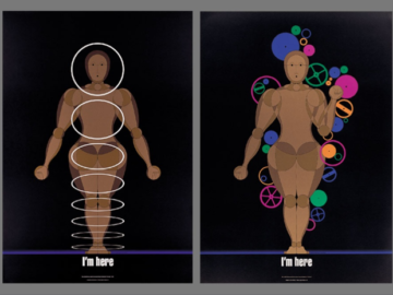
The decorative typeface design beside it was entered to the current Typeface Design competition by Jamal Gunn Becker for his client, skateboard brand HOCKEY. They “began with a wide field of reference which ranged from old boxing movie titles of cinemas golden age to the early drawings of Charles Schultz,” and ultimately the “client resolved to use a bold collegiate phoenix letter alphabet for a more buttoned down look.”
