Two of the latest entries in our Packaging 10 Competition tell us what it means to really redesign a product to get consumer attention. Whether it’s finely aged wine or a convenient salty snack, the packaging has to be on point to really stand out.
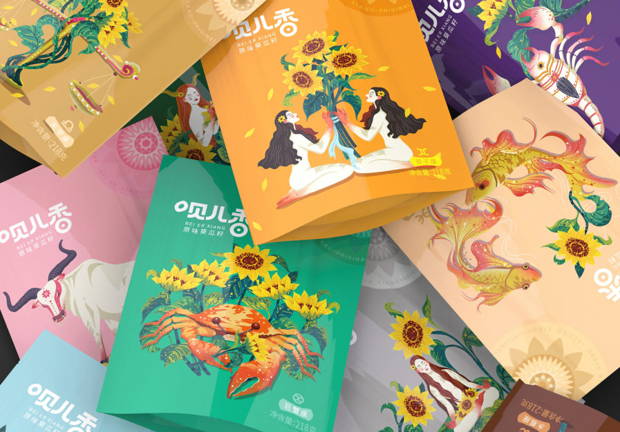
Sun Linlin and Zhou Jingkuan of Left and Right Creative Design make the tasty melon seed snack from Inner Mongolia Nari Lige Food Co. fun and interactive for their consumers. The new line of packaging promotes the seed snack with 12 different bag designs, each representing one of the 12 zodiac symbols.
The work, “Twelve Constellations Sunflower Seeds,” (above) intends to catch the eyes of young Chinese consumers who are interested in horoscopes. As a result of their efforts, the product features 12 beautiful and intricate graphics that all incorporate sunflowers with their depictions of the Western zodiac. Consumers adored the creative packaging, buying seeds that align with their birth month.


