The Design 2023 Awards recognizes outstanding creativity and innovation in design, and Graphis Master Turner Duckworth‘s recent Gold win is a testament to their ability to reimagine iconic brands with a fresh, modern perspective. Their award-winning redesign of the “Campbell’s Red & White Condensed Soup Visual Identity” is a prime example of their exceptional work, and it’s a project that’s worth taking a closer look at. Let’s dive in and explore how Turner Duckworth took a beloved household staple and gave it a soup-er new look.
By: Turner Duckworth
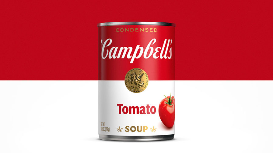
“Campbell’s condensed soups were leading a double life. We’re all familiar with the iconic can made famous by Andy Warhol, which is so renowned that the scripted font, red and white split, and gold medallion spring to mind effortlessly. But less familiar was the truthful can sitting on the shelf of every grocery store across the country. Far from iconic, it featured soup bowls, filled to the brim, emanating steam that swirled around numerous marketing messages and callouts.
“On the one hand, you have red carpet ready. On the other, you have snoozing on the sofa in stretchy pants. Our job was to bridge the gap, reinstate the iconic can, and bring the ever-expanding portfolio of recipes together into a cohesive family.”
So Why Not Make It All Look Like the Iconic Classic Design?

