The Value of Color in Branding: New Talent 2023 New Entries

There are many design elements to consider when creating a powerful brand, but how a designer utilizes color truly makes something pop, and there are countless examples of a color being instantly associated with a brand. In this week’s New Talents entries, the designers are well aware of how color affects branding, and as a result, their entries are bursting with brightness.

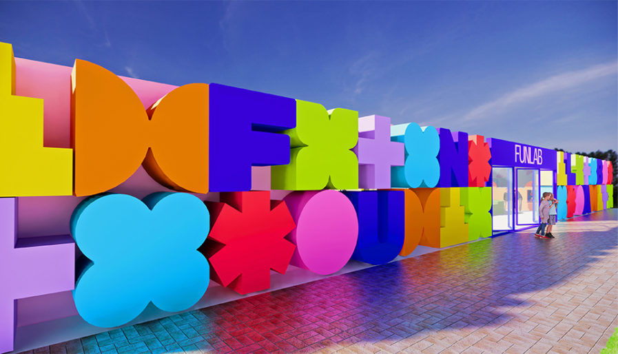
This first entry comes from George Brown University student Yasaman Fakhr. Completed as a thesis design project, Fakhr designed different branding materials for “Fun Labs” (above), a space where families can participate in various kinds of hands-on activities with each other. Throughout the different designs included in Fakhr’s project – ranging from an interactive calendar to interior design – there is a constant emphasis on color and how different hues interact with one another, showing a breadth of knowledge and an intuitive understanding of the importance of color theory. For example, Fakhr uses a bright blue to contrast the white or dusty pink “FUN LAB” logo and the various green, orange, yellow, red, and purple patterns, shapes, and icons. Her entry succeeds in keeping the viewer’s attention by giving them so much to take in yet ensuring they do not become overwhelmed by the amount of design they’re looking at.
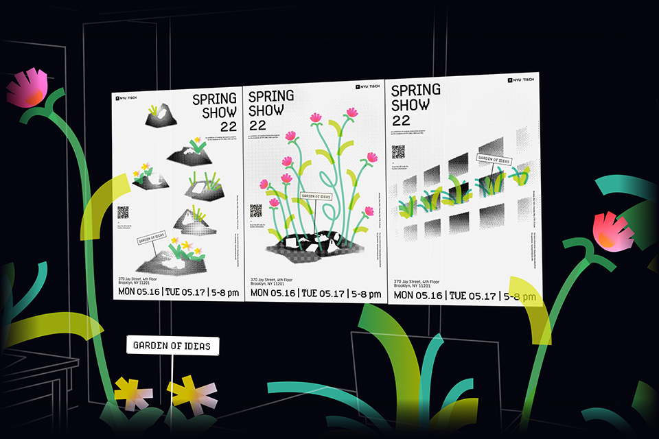
Our next design comes from Andie Yujeong Han, a student at New York University. “Branding ITP/IMA Spring Show 22: Garden of Ideas” (above) was created as a branding suite for the biennial exhibition of the ITP/IMA program at NYU’s Tisch School of Arts. Han’s design contrasts colorful flowers among monochrome dirt piles mixed in with a passport, dollars, a gun, a tank, a laptop, and a plastic bag. The green stems and pink and yellow petals are not only eye-popping but also a potent metaphor for spring itself and blossoming creativity. Han noted how the ITP/IMA exhibition had been canceled due to the COVID-19 crisis multiple times. In acknowledging this, as well as the many tragedies and terrors happening around the world, Han’s desire for this branding was to communicate a message of hope. As viewers watch flowers quite literally spring up from the trenches, viewers are reminded of the power of finding the brightness within the dark and the spring yet to come. 

Both Fakhr and Han made excellent branding designs, rich with technique and bold innovativeness. In each creation, the viewer gets their own lesson in color theory. Understanding why color matters is an important tool for creating meaningful and impactful designs, and the color of each branding identity shows us why we ought to cherish colors even more. 

For more information on our New Talent competitions and to submit your own work, click here.

Author: Graphis