This week’s Packaging 10 entries demonstrate firsthand how the themes of age and growth can be used to create sharp, unique designs.
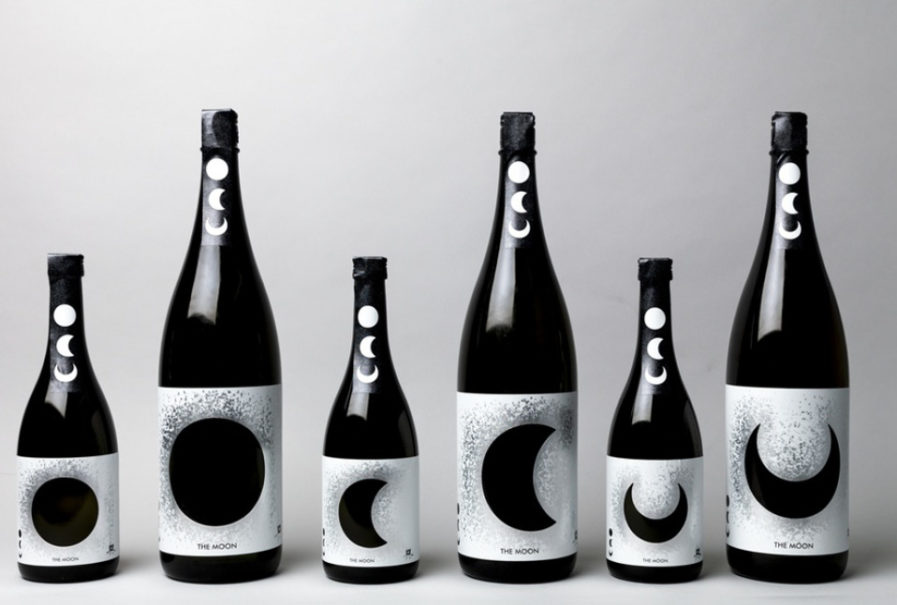
Japanese designer Hajime Tsushima and creative director Yukiko Tsushima crafted an alluring packaging for Sake-Show Yamada and their brand of sake “OKU” (above). The design is ultra sleek and sophisticated, perfectly encapsulating OKU’s theme of maturity and aging. As the sake matures, the flavor deepens, and thus the design concept becomes clear: the changing taste is aptly compared to the phases of the moon. Tsushima explains that “the first new sake of the year is ‘Full Moon.’ The sake that has been slightly aged is ‘Half-Moon’ [and] the well-aged sake is ‘Crescent Moon,’” demonstrating how, just like the moon reaches its darkest stage over time, Oku reaches its deepest tone in its maturity. The end result is “a mysterious design with white printing on a silver sticker. The brightness of the silver looks like a galaxy spreading in space.”
Tsushima nails both the packaging and advertising photos, and they work well together to signal the taste and experience of drinking Oku. Sake is a savory beverage, and the packaging and aesthetically somber photos perfectly convey a powerful, yet comforting taste, much like the moon creates an ambient setting with its illumination. Oku has become increasingly popular and is in demand overseas, making this an exciting and solid new entry.
