More unique packaging ideas have been shared with Graphis as entries for our Packaging 10 competition keep pouring in. This week’s submissions focus on liquor and how vital it is to have both a one-of-a-kind bottle and label design. In order to stick out from competing brands, a package needs to be striking and memorable, and that’s exactly what this week’s entries complete.
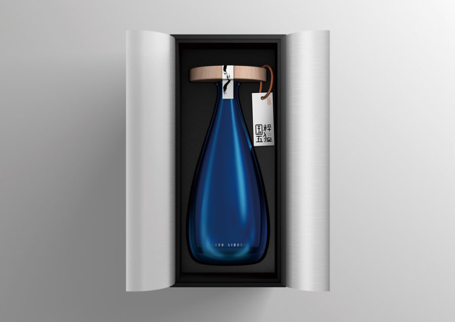
Designer Xiongbo Deng from ShenZhen Lingyun Creative Packaging Design Co., Ltd. developed a bottle for Beijing Yuxinlong Wudu Ecological Technology Development Co., Ltd.’s “Guocui Wudu” (above). The drink is made up of five traditional Chinese medicinal materials that are soaked and brewed. While there are similar drinks on the market, competitive products usually contain some dregs left behind from the brewing process. The biggest selling point of Guocui Wudu is that through multiple processes, the purity of the liquor approximates a zero-impurity state, providing consumers a stronger sense of drinkability.
This concept influenced the concept of “cleanliness” as the keynote of the package design, which Deng utilized with blue transparent glass for the container. Having the label separately displayed and hung on the wide bottle cap represents organization; there is not a lot distracting the consumer. Looking at the entire package design, the unique form presents a distinctive aesthetic and demonstrates the concept of medicinal brewing behind the product. While we don’t know how effective this package’s design is since the product is only sold in the Henan Province of China, we think it’ll find great success.
