We’re coming back at you with some of our latest Packaging 10 Entries! These designs are artfully crafted and help complete both the look and feel for some truly special products. Read on to see what makes them so wonderful.
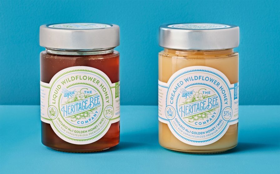
“Heritage Bee Company” (above) was designed by Chad Roberts of Chad Roberts Design Ltd. in Canada for the Heritage Bee Company. As a company that specializes in raw, premium, and unpasteurized honey products, Heritage Bee Company stresses the importance of the preservation of bees and the vital role they serve in pollination. This is mostly done through what they call “Hive-hosting Programs”, in which consumers can host their own beehive and ensure that the bees (and their honey) are getting the very best care. These programs connect the customer to organic beekeeping and enforce the idea that bees need our help to avoid dying out, something that would be absolutely disastrous for our environment.
Because of Heritage Bee Company’s very deliberate mission, Roberts chose to go with a design that would feature the most important part of the company: the bee itself. With an image featuring a honey bee pollinating the wildflowers that surround it, the packaging also includes woodcut style illustration, custom drawn letter forms, and a bright color palette with hallmarks of craft tradition. These designs were used on jars of flavored cream honey, seed bomb pouches, and gift boxes. Roberts’ work was a huge success, as the client was in love with the design and even commented that they were “grateful to have partnered with this extraordinary team of super talented folks who understand design on a level we’ve never seen before.”


