This week’s Silver winners for our 2023 poster competition all use typography as a major component of their design, showing us how a wide variety of forms and uses can be applied to create a compelling and effective poster design.
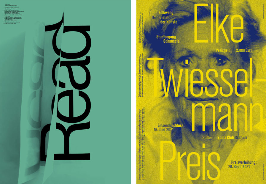
Our first poster is “Read More 2021” (above, left) created by designer Fidel Peña from the Canadian design firm Underline Studio. This poster is part of a self-initiated campaign by the studio to encourage reading amongst designers, a project the company has undertaken every year since 2018. The poster both encourages the viewer to read while also listing the Top Ten Books Read in 2021. However, the actual list itself is tiny, framing it so as not to be the focus of the design while also keeping it from cluttering the rest of the poster. The centerpiece instead is the giant word “read”, overlayed with both a reflective and a warping effect that creates the illusion of turning book pages. The turquoise background is also highly eye-catching, drawing the viewer into the core message: read!
Our second poster is “Elke Twiesselmann Preis” (above, right) from German designer Thomas Kühnen and was created for the Folkwang University of the Arts in Essen, Germany to promote the first edition of the “Elke Twiesselmann Preis,” an award with the intention of supporting female actors enrolled in the university’s degree course in acting. The poster was screen printed in two single colors, yellow and dark blue, which serve to help the poster pop. In terms of typography, the award’s name is front and center, made larger and bright yellow to grab the viewer’s attention. Other details about the award ceremony, such as the prize money and the date for the ceremony, are tucked in the spaces created by the main text. The woman’s blue face also serves to embolden the yellow text even further, overall creating a striking visual effect.
