Are you looking for a creative and unique way to package your product? If so, you might be inspired by the work of some recent packaging designs. From Hatch Design’s collaboration with Planet FWD for Moonshot to YiFei Hu’s design for Grace Moon Scented Teas, innovative packaging solutions are everywhere if you know where to look. In this article, we’ll explore how imaginative design can elevate product packaging to truly captivating heights. So buckle in and let’s take a close look at the work of these inspiring designers.
Hatch Design: Moonshot Snacks Take A Bite Out Of Climate Change
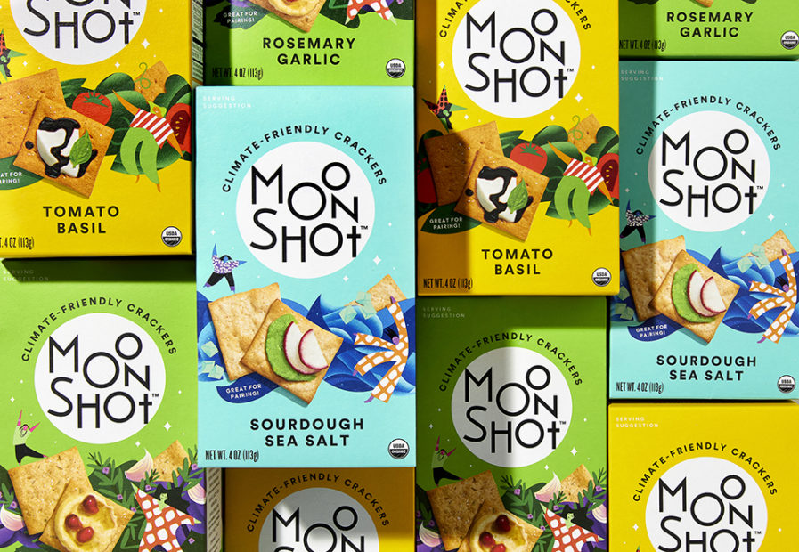
As its name suggests, “Moonshot” (above) is a snack brand big on taste and on a mission to tackle climate change by changing how the world snacks. Moonshot’s cracker ingredients include regeneratively grown wheat from American family farmers, and it considers its impact on the planet with every decision, from seed to the end consumer.
The brand is part of an overarching plan by its owner, Planet FWD, to establish a network of farmers that use regenerative farming so other manufacturers can tap into them. The Moonshot snack brand looks to convince food producers that products made with regenerative agriculture could be viable, delicious, and, most importantly, attractive to many consumers. As the world faces unprecedented food crises, this is a significant development with the rapid depletion of natural resources.
As part of this mission, Hatch Design was tasked with positioning and naming the brand, developing the first line of products, and creating a brand world supporting the broader environmental mission. To reflect the goals of its parent company, Hatch recommended the name Moonshot, a unique, lofty name ideal for a brand set on changing the world. Hatch also designed the packaging to be uplifting and representative of a larger community, using bright colors and taste-forward visuals that jump off the shelves while positioning the mission-focused messages in a support panel that provides a friendly and entertaining 3-D experience. Plus, of course, its packaging is recyclable and made from recycled materials, and the brand is carbon-neutral certified!
Hatch helped to prioritize brand storytelling, keeping the larger mission front and center and not at the expense of what’s necessary to grab shoppers’ attention. The aim was to make every purchase feel like you’re celebrating something good and also help make fans feel like they’re part of a meaningful movement fighting for change, one cracker at a time.
In the end, Hatch helped build a brand that shoots for the moon, and they are sure to be among the stars for their stellar design, considering it won Silver in our 2023 Design competition!
