Raise A Glass To 30 Years + Maker’s Mark Makeover: Design Winning Work & New Entry

A milestone birthday deserves a milestone celebration, and for designer YiFei Hu, that celebration came in the form of 30 beer cans, each featuring a unique design from over the years. In the meantime, Turner Duckworth unveiled a new visual identity for Maker’s Mark that honors the bourbon’s heritage and modernizes the brand while staying true to its roots.

Celebrating 30, YiFei Hu Pops the Top with Unique Beer Can Creations

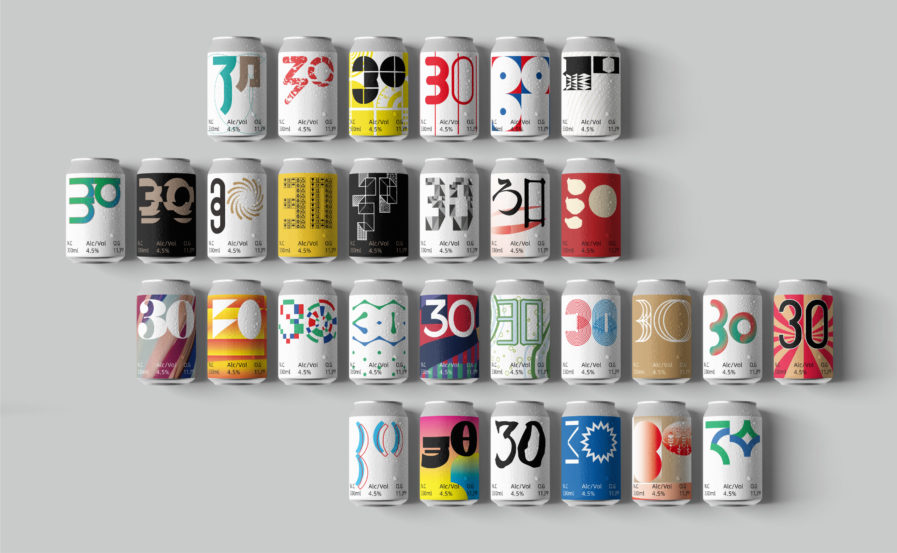
Happy Birthday” (above), a new entry to our Design 2024 Awards competition, is something to celebrate. Created to mark their 30-year birthday, YiFei Hu from DesignOut Lab saw the project as a chance to merge two passions: designing and drinking beer! Hu curated 30 design projects to record the work, study, growth, lessons, and experiences from the past five years and applied those designs to 30 beer cans to commemorate the birthday. We can confidently say that Hu’s design life has been poured into the beer labels. Every can is unique in its own way, whether through a unique blend of colors or a bold font choice, but there is more than just visual appeal; each can carries an individualized story, from reflecting on a concept to deciding on the perfect wordplay. 

The intricate details are more than enough to draw you in. Each label features a creation date in the upper left corner and a logo or symbol in the lower left corner for that specific project. To bring the design together, the number “30” is included on each can. You can find a product description and an introduction in the upper right corner. For added flair, a mock bar code in the lower right corner happens to be Hu’s birthday!

Take some time to explore each label, and you’ll quickly see how much heart is in this project. Every aspect reflects Hu’s experience and expertise, making it one-of-a-kind! Each piece demonstrates the process, passion, and dedication put into its creation, becoming more than just some artwork. The cans communicate their own set of details, joys, and troubles as those stories are a part of the company’s growth and reflect the process, passion, and dedication put into its creation. They also remind Hu of when they created each represented work for their clients. The result? A reminder that enjoying life should always be our priority! Cheers to a happy 30th birthday, YiFei Hu!
Tapping Into Expertise: Turner Duckworth’s New Visual Identity for Maker’s Mark

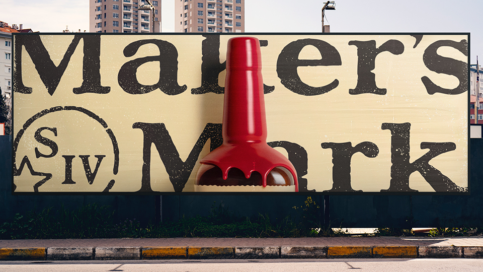
Maker’s Mark is one of the most iconic bourbon brands in the world. And while the classic look of the bottle and the red wax seal is instantly recognizable, the brand realized it needed to revisit its visual identity to stay relevant. “Maker’s Mark Visual Identity” (above), a recent Silver-winning rebranding made by Turner Duckworth, provides an interesting case study of updating a visual identity while staying true to the brand’s core values.

Loren Schott, a lead designer at the London branch of Turner Duckworth, was tasked with leading a team to create the visual identity for Maker’s Mark. Thankfully, they had the perfect solution. Rather than trying to reinvent the wheel, they took a crafted approach to design, staying true to the core values of the brand while at the same time ensuring a consistent focus on modernity and freshness to appeal to a new generation of consumers. By breaking away from traditional whisky category codes of barrels, rich wood, and dark rooms, they created an identity that was modern, energetic, and appealing to the next generation of bourbon drinkers.

To meet these needs, Schott and the team devised a unique strategy with assets including recreating a graphic “red wax drip” and using traditional wood etching techniques and two custom fonts based on the beautifully imperfect language found on the original 60-year-old label. The result is a system that lives and breathes the brand idea of ‘hand-made,’ reflecting the bourbon-making process the distillery has pioneered since its founding. Through a unique red and cream color palette, red wax seals and transitions, and a new graphic icon, the brand’s unmistakable wax dip is semiotic and reinforced throughout the system—to build global familiarity and recognition, all while challenging whisky conventions.

Makers Mark’s rebranding is a testament to staying true to core values, even when modernizing. The success of the project proves that with an expert eye and thoughtful execution, a brand can evolve without compromising its essence. As this demonstrates, updating visual identity is essential for brands to remain relevant in today’s competitive marketplace. It also serves as a reminder of how effective strategies crafted by experienced professionals can help brands succeed for decades to come.

To see more award-winning 2023 design work, click here. To enter our current Design 2024 competition, click here.

Author: Graphis