Watcher: 1970s Horror Meets Modern Suspense

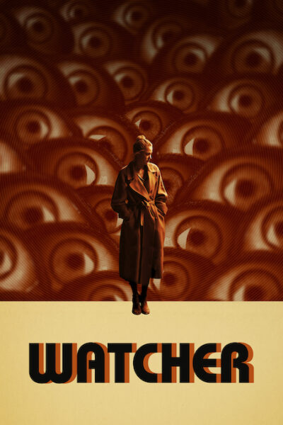
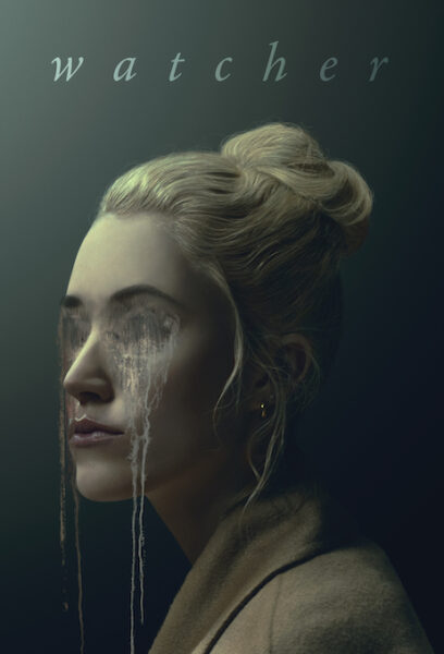
The “Watcher” campaign is a collaborative effort between The Refinery and their client IFC Films for a series of key art that echoes the psycho-horror-thriller genre with a 1970s twist. This project merges a sense of dread with the feeling of being watched through creative work like the Key Art and alternative social media. Each piece uniquely captures the essence of paranoia and suspense of the lead character.

By: The Refinery

In Watcher, a quiet, cunning psychological thriller, an American couple relocates to a beautiful, if sterile, apartment in Bucharest. While the husband, Francis, works, his wife, Julia, waits—filling her hours with errands, ennui, and a deep sense of displacement. When she notices a neighbor watching her from his window across the street—a development unnervingly timed with reports of a local serial killer—Julia’s depression transforms into dread, leading the viewer to wonder: Is she attuned to a legitimate threat? Or has boredom and loneliness eroded her sanity? 

Our goal, always, in creating key art: Embody the film’s aesthetic (a noirish pleasure) and tease the narrative without tipping our hand. In terms of Watcher’s visual choices—the large picture window, the alluring blonde, the shadowy lighting—an homage to Hitchcock is clear. As for the narrative, we focused on a single thematic question: Who is watching who? Or, to phrase it another way: Is Julia’s perspective valid—or suspect? 

Everything comes together in the final image. In her negligee, Julia embodies a classic noir heroine. Her placement behind a window lends her a trapped, observed quality. Her translucent reflection points to her character’s vulnerability—the porousness of her boundaries, the unstable sense of self. The raindrops on the glass, through depicting Bucharest’s literal climate, also serve to create emotional weather: Julia’s world is dark, tearful, lonely. The image of the neighbor, obscuring Julia’s right eye, further questions the veracity of her perspective. Is her view of things, indeed, ‘right’?

The companion art plays with these ideas, too—eyes melt, reflect, and multiply—while the sepia color palette doubles down on the vintage feel. In one image, the eyes appear both gouged and tearful, a melding of physical and psychological pain. In another, Julia’s right eye, glassy with fear, “captures” the reflected image of her neighbor (but is she a prisoner to his gaze—or the other way around?) In another image, a congregation of eyes creates a literal field of vision, before which Julia looks particularly small, defenseless and exposed. 

Taken as a whole, these four images create a deep sense of foreboding. Julia’s trench coat, though stylish, does nothing to ward off the chill.


The Refinery is a creative ad agency specializing in print and a/v advertising with a focus on the entertainment industry. Clients include AMC, Bravo, Dimension Films, Disney, Focus Features, 20th Century, Genius Products, HBO, Oxygen, Paramount, Sony, TNT, Universal, Warner Bros., and Weinstein Co. Here, kindness is what defines our people, culture, and community. It is the thread that connects us, makes us feel good, and informs all of our actions. And in our talented collective of passionate ego-free thinkers and doers, we believe EVERYONE deserves a place in which they are treated with kindness. That’s how we do things, and that’s what makes our work and our people the best in the business!

Social: Instagram, X, Facebook, LinkedIn


Discover more award-winning Poster 2024 entries here. And don’t forget to enter our Poster 2025 competition!

Author: Graphis