With our 2023 Design competition fully wrapped up, we have even more winning designs to showcase. This week, we have three Platinum-winning entries that all use fun and whimsical design techniques to get their messages across.
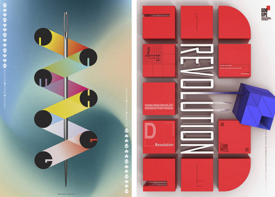
Our first winning entry comes from Mike Hughes Creative Direction + Design, with their “Pam Hogg Poster” (above) used by ROTOR magazine. Pam Hogg is a fashion designer based in Scotland who’s been a figure in the fashion industry since her first collection was released in 1981. Hogg’s fashion designs have a bright, playful feel to them, but also carry a punk rock edge. This poster meant to promote her work reflects the style of her fashion through typography and design. The overall design uses sewing and measuring as a design motif; the letter forms are kept simple, and their design is meant to resemble buttons. The corrugated/accordion fold was a design based on foldable rulers, and the needle was added to further ground the concept in sewing and fashion. The overall design is colorful and eye-catching, serving as the perfect introduction to Hogg’s work.
Our second design comes from Graphis Master Hoon-Dong Chung at Dankook University, with their poster “D Revolution” (above, right). This poster was designed to promote the 2021 Gwangju Design Biennale, a contemporary art biennale held in the Gwangju, South Jeolla province of South Korea. The 3D typography is meant to convey the idea of “D Revolution,” the primary theme of the biennale that year. The choice of color also makes the entire poster pop and draws attention to the out-of-line blue cube, showcasing its importance.
