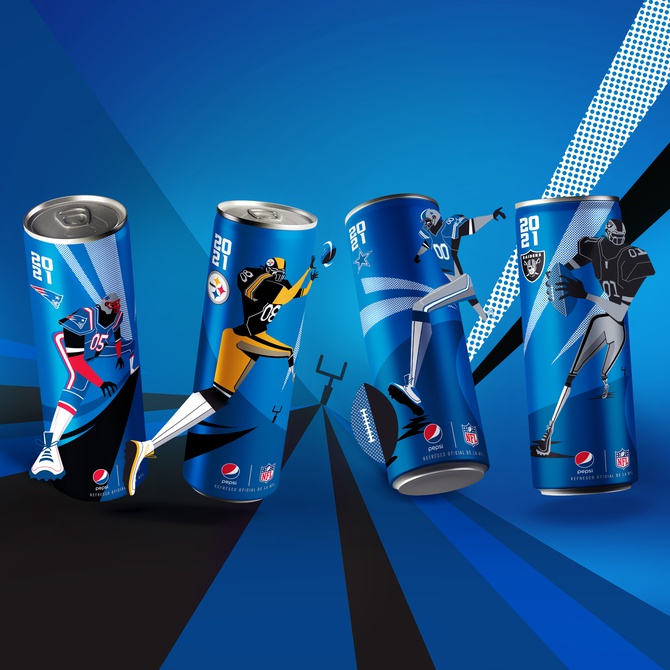
PepsiCo Design and Innovation has been creating multiple products in other countries that are impressing us here at Graphis. These designs are unique and bring a sense of modernity to the plentiful dull packaging you might find when strolling through the store. We think these designs are great, and we hope you do too!
“Pepsi x NFL – Mexico”(above), PepsiCo’s new soda can design, features images from four of the NFL’s greatest teams: the Dallas Cowboys, the Pittsburgh Steelers, the Las Vegas Raiders, and the New England Patriots. This new series being released in Mexico, which houses some of the biggest fans for these four teams. PepsiCo wanted to ensure that this design would get a second look among all the other products sporting brand deals with the NFL. As such, the design team knew they’d need more than some nice art and a fun logo, so they went in their own special direction. With a look based on a disruptive style of art, these cans captured iconic moments of the game such as touchdowns and epic runs. The designs also used dynamic angles and textures combined with team-specific color palettes to create a unified collection for the NFL. These great designs are really helping people in Mexico get ready for their favorite team’s next game!


