This week’s design entries feed our souls and our stomachs!
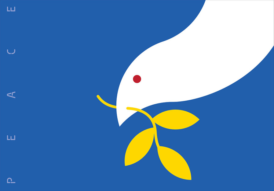
For centuries, a dove with an olive branch has been viewed in many cultures as a messenger of peace, love, and freedom. Because of this international symbolism, the dove and olive branch are typically used in art as a response to global crises, wars, and devastation. In light of Russia’s hostile invasion of Ukraine, artist Randy Clark created the poster “Ukraine Dove” (above) to show solidarity with the citizens of Ukraine and to promote peace in the country. Wanting to simply get the message across, Clark utilized a clean modernist composition to portray a white dove carrying an olive branch in its beak that seemingly leans its head into the frame, with the word “peace” along the edges of the poster. Clark cleverly uses his color choices to make the poster focus on Ukraine by using the country’s flag colors, blue and yellow, for the background and olive branch respectively.
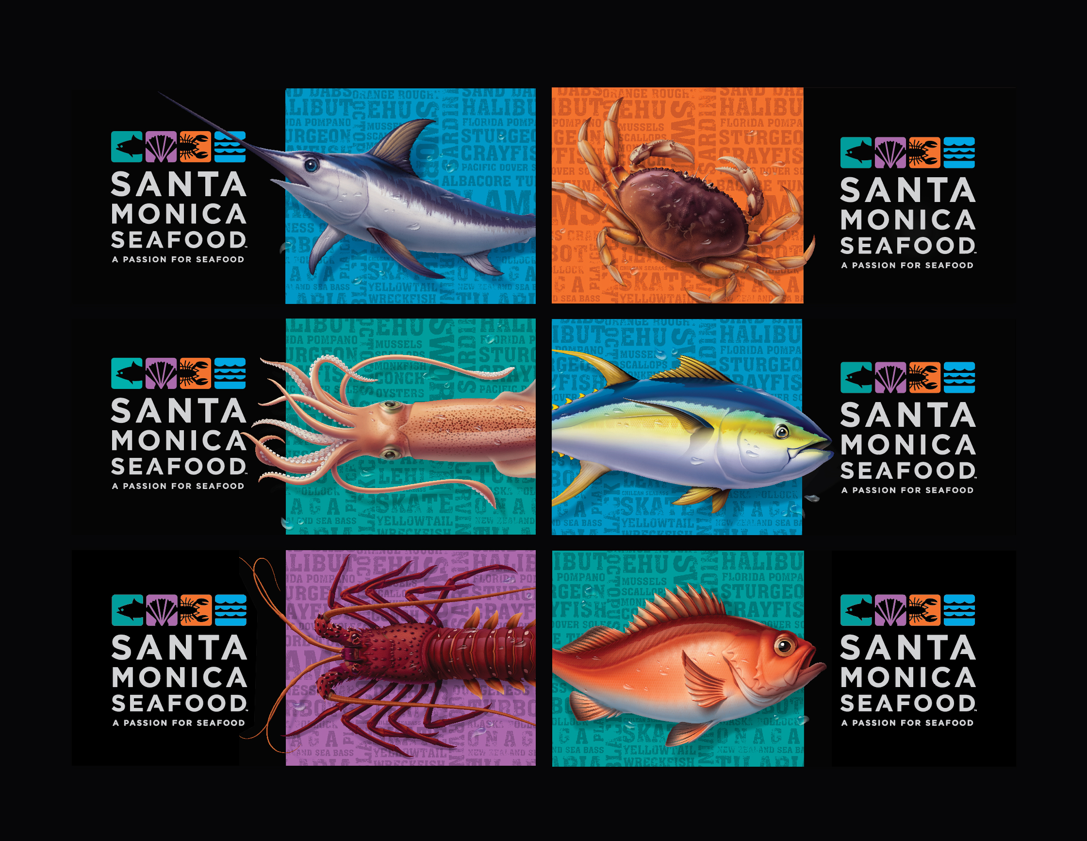
In 2019, the leading food distributor Santa Monica Seafood was seeking a freshbrand revamp to better communicate the history and tradition of its company as well as its commitment to delivering high-quality seafood as they prepared to expand their company and evolve its offerings. To achieve this, the seafood company entrustedPH Studio with devising the “Santa Monica Seafood Brand Identity” (above). The redesign included a new logo, truck fleet graphics, frozen seafood packaging, and sauce/marinade labels.
While working on the project, the team wanted to update the 30-year-old brand identity in a way that preserved elements of the original brand. The distributor’s older system utilized graphic illustrations of various seafood species in a dark blue, tone-on-tone execution. As a nod to that look, the design team developed pictograms with Sans Serif typography for the primary brand with a system of color backgrounds based on the brand colors, including blue, turquoise, orange, and light purple. PH Studio also created six detailed seafood species illustrations for the truck graphics (which originally had been an important facet of the company), which could be rotated on each side to create additional variations on the many different truck types. Santa Monica Seafood was very pleased with the overall look stating that the imagery and layout of the brand’s new logo perfectly represented the four cornerstones on which the organization was built: “Quality, Integrity, Reliability and Service. These principles are underscored by what makes Santa Monica Seafood stand out, A Passion for Seafood.”
The deadline to submit your work to our Design Annual 2023 is only eight days away! Visit graphis.com to learn more.