The deadline for our Advertising 2023 competition is midnight tomorrow. Check out your competition and discover past Platinum winners with this week’s blog!
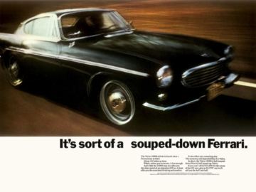
First up is a 2019 Platinum-winning poster advertisement, devised by the British creative technology agency Splash Worldwide to promote a new range of pens for Parker Jotter in “Parker / Jotter London” (above, left). Heralded for its beautiful craftsmanship and sleek design, the company focuses on providing quality pens to consumers who value fine writing utensils. However, as Parker Jotter continues to expand, it began to seek ways to target the UK market, specifically the “young, lively, individual, and quality mindful consumer, looking to take their first steps into the good writing category.” As part of their task, Splash Worldwide needed to find a way to amplify the reach of Parker Jotter that increased impact and drove awareness in consumers between 18-30 years old. For their approach, the agency’s creative team played on the fact that each pen was named after a different London address, and combined them together, resulting in a Union Jack image made up of the writing utensils. With the image came the brand’s new ‘Just A Click Away’ slogan became a simple sign-off that alluded to the famous Jotter pen ‘click.’ Splash Worldwide’s concept was so successful that Parker Jotter changed all of its packagings to match the design, including print, point of sale, and a TV commercial based on ‘Just A Click Away.’
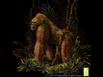
Animal Kingdom is a drama series created by Jonathan Lisco that first aired on TNT in 2016 with great success. Set in a small beach town, the show follows the main character Joshua “J” Cody who is taken in by extended family, only to enter a world of crime and violence. To promote “Animal Kingdom S3” (above, left), American firm and Graphis Master ARSONAL developed their 2019 Platinum-winning poster ad that takes a slightly different approach to the visual theme from previous seasons to convey the constant threats looming just behind the characters. When past posters typically used fire motifs to communicate the show’s literal and figurative combustive nature and danger, this time the agency utilized water, showing a character screaming underwater. While the murky image is ambiguous in identity and nature, it’s clear in its volatility, and with a sharp contrast between the yellow and orange of the person’s skin with the cool blue of the depths below, the poster implies fire without actually showing it, creating a unique continuation while warning viewers about what’s to come.
