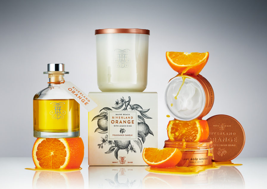
For the Packaging 10 competition, Harcus Design in Australia submits their entry, “Riverland Orange” (above). This entry is part of a seven-part series of delicate designs for Maine Beach’s line of beauty and body care products. Their composition is layered with intricate detail, from the illustrations to the embossed text and patterns on the tins and bottles. The orange color stands out against the cream of the base design and does an excellent job of representing the orange and lemon rind ingredients. Despite the different tubes, bottles, and tins, they were able to construct a cohesive design across the range of product shapes. Harcus Design creatively establishes an elegant identity that encapsulates the Riverland Orange brand.
