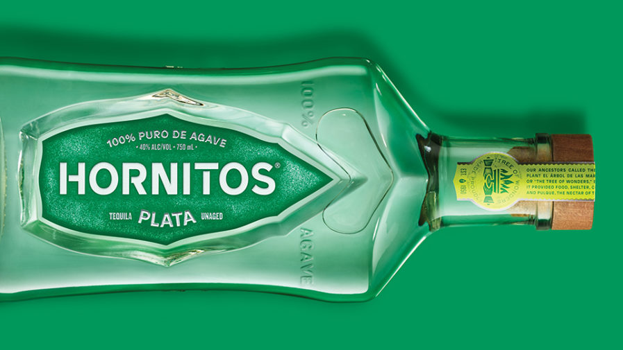
The US branch of Turner Duckworth has entered their Mexican tequila packaging for “Hornitos” to the Graphis Packaging 10 competition. Designers Jamie McCathie and Ian Conklin revolutionized their branding and message. They aimed to find a balance between the traditional and the modern. The bottle is eye-catching with a green color palette, and a deboss that draws people in to focus on the center of the label. Turner Duckworth has many award-winning designs under their belt, including Platinum, Gold, and Silver. Revitalizing Hornitos tequila while holding true to the original design is sure to reach new and familiar consumers.
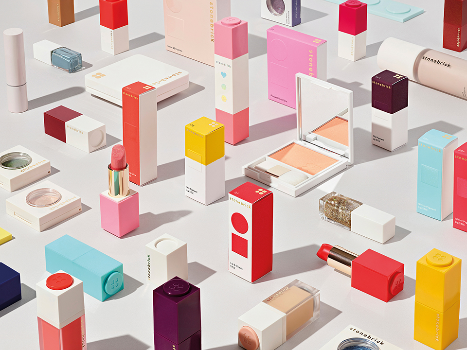
The team of designers at Established NYC also enter the competition with their above design for a makeup brand, “Stonebrick.” Created for Korea’s largest retailer, Emart, they were tasked with developing a fun brand that would encourage consumers to collect the different types of makeup. The result of this was a customizable collection that incorporates magnets so that people can stack and create their own collection. Everything from the packaging, identity, graphics, and campaign photography was designed by Established. Their innovative branding definitely creates a more interactive and personal experience.
Submit your new and creative designs to the Packaging 10!