From layout to typography, good editorial design is the foundation of any publication and has a significant impact on how information is read and understood. The students behind these design submissions combine creative visuals and design fundamentals to create compelling layouts and transform the reading experience.
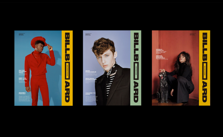
Winning Gold in our 2022 New Talent competition, Jieun Lee, a design student attending the School of Visual Arts, creatively redesigned “Billboard Magazine” (above) as an assignment by professor Pedro Mendes, who tasked his students with choosing a magazine and creating a new layout design inspired by its content. For her approach, Lee took original elements from Billboard’s traditional layout and used them to make an updated layout application that stayed true to the magazine’s identity. Using their billboard chart system, Lee took its bold font, rectangular shape, and table template and applied them to her new design, along with Billboard’s use of bright colors. As Lee explains, “The shape emphasizes the information inside the shape, and the shape itself serves as a graphic element.” Featuring some of the music industry’s most influential artists on the billboard chart, including Lil Nas X, Beyonce, Troy Sivan, and Billie Elish, Lee’s new design system offers a smart way to enhance the content it’s presenting, leading to a final product that’s ready to publish.
ArtCenter College of Design Masters student Christine Bobae Lee lays out the fundamentals of contemporary south Korean design for western designers in her entry to this year’s New Talent competition. As Bobae explains, there’s been a rise in popularity surrounding modern Korean media around the globe, leading many companies in the US to invest in and create their own content; however, there’s also a lack of understanding and English resources on what defines modern Korean design, or K-design. To combat this, Bobae decided to dedicate her senior thesis to creating the manual “K-Design” (above) which outlines the rise of Korean media in the United States as well as explaining the key features of K-Design in a highly visual and easy-to-follow format.
As Bobae explains it, K-design is defined by three fundamentals: artistic experimentation, experiential design, and se-ryeon, which is Korean for new, clean, sophisticated, and on-trend. All three of these make up the manual’s design. For its experimental portions, she played with the type by creating augmented reality typography that people could use their phones to see as a 3-dimensional interface. To further enhance the reader’s experience, Bobae incorporated QR codes and sequential images. The manual also comes with a pack of stickers that can be used to decorate the manual’s blank cover. For the se-ryeon fundamental, Bobae based the manual’s design identity on current K-Design trends that focus on early 2000s cyberspace, which manifests in the incorporation of rhinestone design elements, pink and purple gradients, and quirky 2D iconography and design elements. Overall, Bobae was happy with how the manual came out, and she enjoyed putting the project together because it gave her a deeper understanding of her identity as a Korean American designer and how studying historical and cultural context allows people to make a proper analysis and create authentic work.
Are you interested in submitting your entries to our New Talent 2023 Annual? Visit graphis.com to learn more. And if you need inspiration, check out our New Talent 2022 winners!