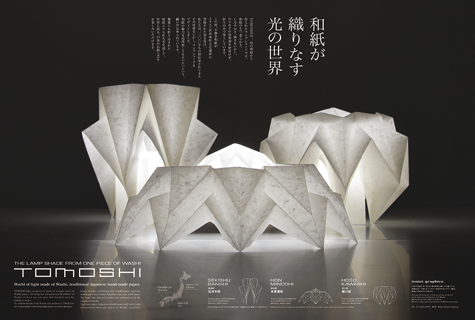
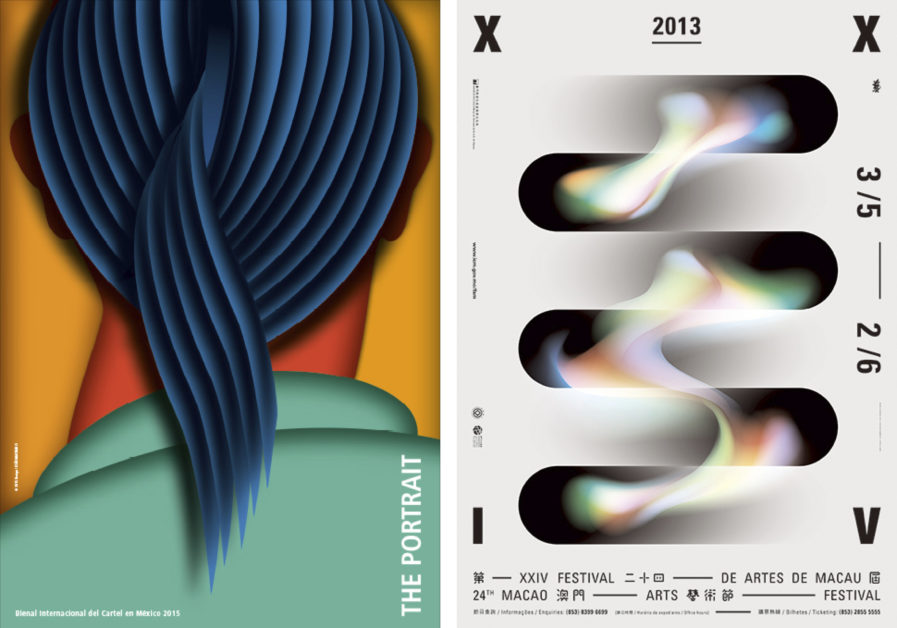
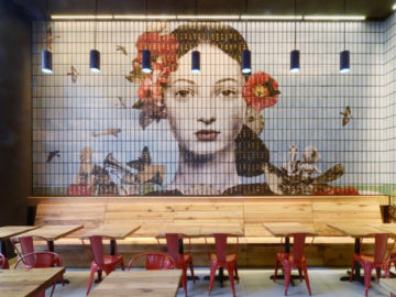
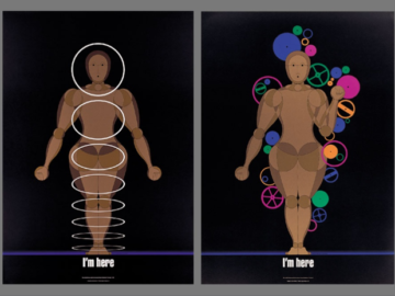
These past winners all have something different to share with the world, yet all revolve around a common theme: light, or rather, lighting. Whether it’s paying attention to how to light a figure or a literal, physical lamp, these posters are designed with a special flair toward saturation.
Graphis Master João Machado designed the Platinum-winning “The Portrait” (above) for the International Biennial of Mexico. The organization challenged him to conjure a memory of a personal experience within his career and create an entirely new poster from it. The resulting design is a portrait of an acquaintance of Machado’s, though an unconventional one, as the face of the person is turned away and hidden. Instead, the viewer sees intricately detailed, beautifully curved hair running along a long neck. The hair becomes the “face” of the person. With a limited color palette and a smart use of shading, the finished work is an enlightening study of what, exactly, a portrait can be, inviting viewers to consider how, in Machado’s words, “there are many other signals … to a certain way of being.”
“24th Macao Arts Festival” (above, right), a Gold winner designed by Leong Chi Hang and Nono from Chiii Design Ltd., was made for the annual Macao Arts Festival held by the Cultural Affairs Bureau of the Macao SAR government. Every summer, world-class artists are invited to perform in Macao and share their experiences, bringing together a variety of theatre, dance, music, circus, multimedia, and visual arts. The text and numeric information aren’t the main points of the design, though they are essential; instead, the text borders the central image, creating a panoramic effect similar to watching lights blur as you squint your eyes. This is achieved by the colors floating from left to right atop the solidity of the black, abstract shapes. The viewer becomes keenly aware of these different ideas of space and form, environment and people, and communication and atmosphere.
