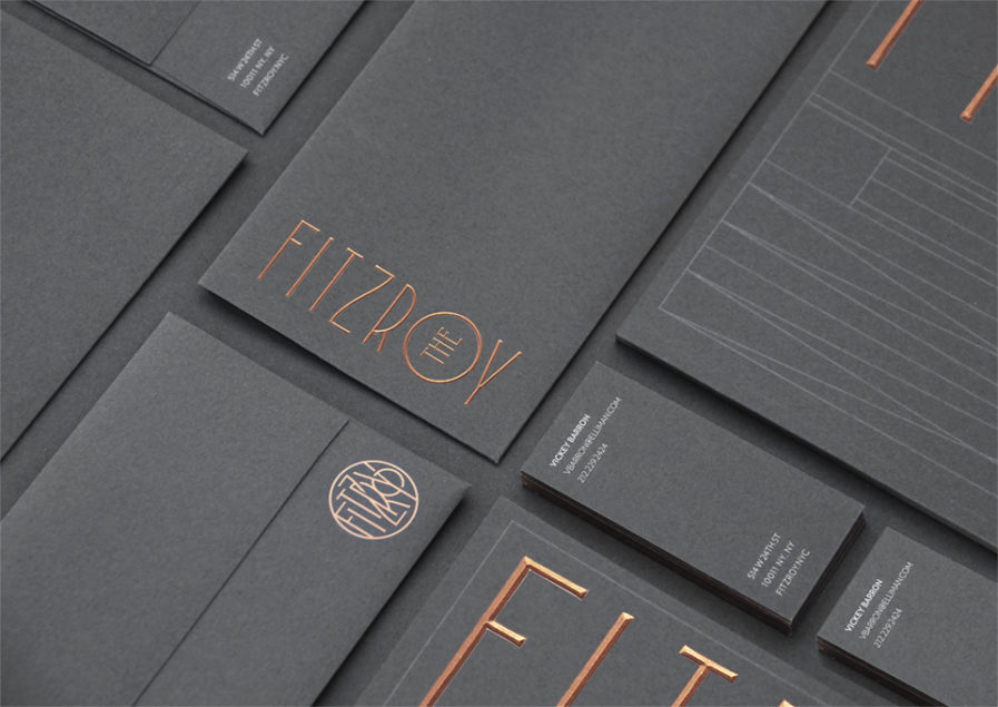
ABOVE — Kevin Cantrell Studios (Utah, USA) for JDS Development Group | Designer: Kevin Cantrell | Strategy Director: Chris Crosby | PLATINUM AWARD
IN THEIR OWN WORDS:
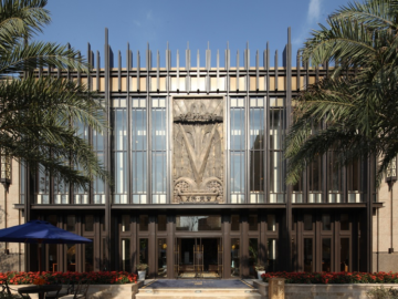
The Fitzroy — a luxury residence in West Chelsea, NY — is a one-of-kind collaboration by celebrated design team Roman and Williams and JDS Development Group. The Fitzroy brings back character and beauty through the historic roots of New York Architecture. The building features green terra cotta façade and large copper-framed windows.
JDS Development contacted Kevin Cantrell Design to provide a strategic framework for naming the building as well as to create a comprehensive brand identity system as rich as the building’s heritage. Leveraging the historic roots of the building, Kevin Cantrell Studio discovered the lost Fitzroy Road that ran through Chelsea in the late 19th Century. This provided an apropos basis for a name that also informed the visual direction for the building to be historically informed but relevantly applied across all brand touch points.
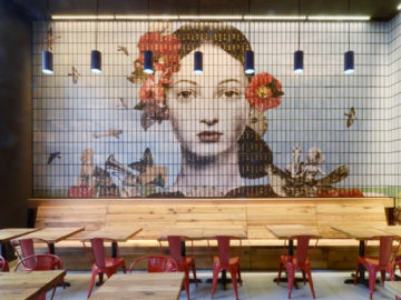
Kevin Cantrell Studio created a dynamic and contemporary brand identity system across multiple brand touch points including stationery, brochure, sales promotional package and kit, floor plans, website, billboards, signage, photography art direction, and a proprietary font (Fitzroy Display), all as signature as the building itself.
