From the past to the future, this week’s Design Annual 2022 entries will take you on a journey to define the spirit of our ever-changing world.
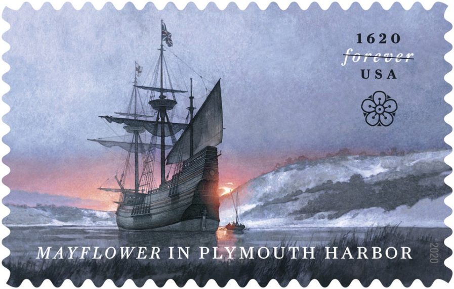
Let’s travel back to 1620 with Greg Breeding and Greg Harlinand their design, “‘Mayflower’ in Plymouth Harbor.” Breeding is the president and product studio director of Journey Group in Charlottesville, Virginia, which he also co-founded in 1992. Harlin is an acclaimed artist and illustrator out of Annapolis, Maryland, and specializes in historic illustrations. Both have over twenty years of experience in their respective fields. They collaborated to design this stamp for the United States Postal Service to celebrate the 400th anniversary of the Mayflower arriving in Plymouth Harbor.
Both the artist (Harlin) and art director (Breeding) decided to portray the ship at dawn as it came into the harbor, a scene that has previously not been seen before. Extensive historic research provided them with the design, dimensions, and color of the ship. The digitally refined watercolor, gouache, and acrylic painting showcase a scene of desolate beauty, signifying the end of the Pilgrims’ traumatic journey to an unfamiliar new world. The stamp also features a stylized, printed hawthorn flower; in England, the hawthorn — a member of the rose family — is sometimes called a mayflower, as it often blooms in May. The stamp was well-received, to say the least; nearly 70% of them sold in the first six months of release!
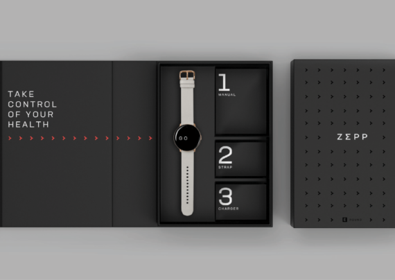
And now onto the future! If you are looking for inspiration to take control of your health, look no further than “Zepp: Defining a global, premium health management brand” A pioneer in motion hardware design, Zepp has previously been known for their smart devices that track athletic performance. In recent years, however, it began to envision new possibilities for the future: a transition from being a niche sports performance brand to a leader in premium health management, with a new ecosystem of smart devices and apps. With an industry full of other tech giants, Zepp was looking to bump up their brand identity and found designers Bill Darling, Emiko Osaka, and Thom Finn of New York-based Lippincott design firm.
Lippincott focuses on six key areas when it comes to their clients: brand, innovation, design, experience, marketing, and activation. The firm does research in order to determine the best course of action for each client and their brand and found that for Zepp’s target customer, the definition of “healthcare” has grown from a focus on just physical activity to a desire for a balance between physical and mental health. It was obvious from this research that Zepp’s new vision had to speak to these core customer needs: putting them in control of their health with advanced AI capabilities and therefore making it easy to become healthier.
This vision is most explicitly reflected in the new “E” logotype. Designed as an interpretation of Sigma — the Greek mathematical symbol that signifies the sum of everything — it seeks to represent Zepp’s use of AI technology to give their consumers precise and accurate control of their own health. The team took the reflection even further with the color palette, a gradient of day-to-night colors inspired by hues of twilight. The cool blues and greens reflect the calming experiences of rest and meditation, while bright reds and golds burst with energy. Zepp premiered their updated brand with the reveal of their Zepp E smartwatch in August 2020. The watch was applauded for its sleek and sophisticated appearance. In a world still ravaged by COVID-19, where holistic health and control over one’s own wellness is more important than ever, Zepp is positioned to make its mark on the healthcare technology landscape.