The Lin Life: Designer Leo Lin Featured in Journal #368

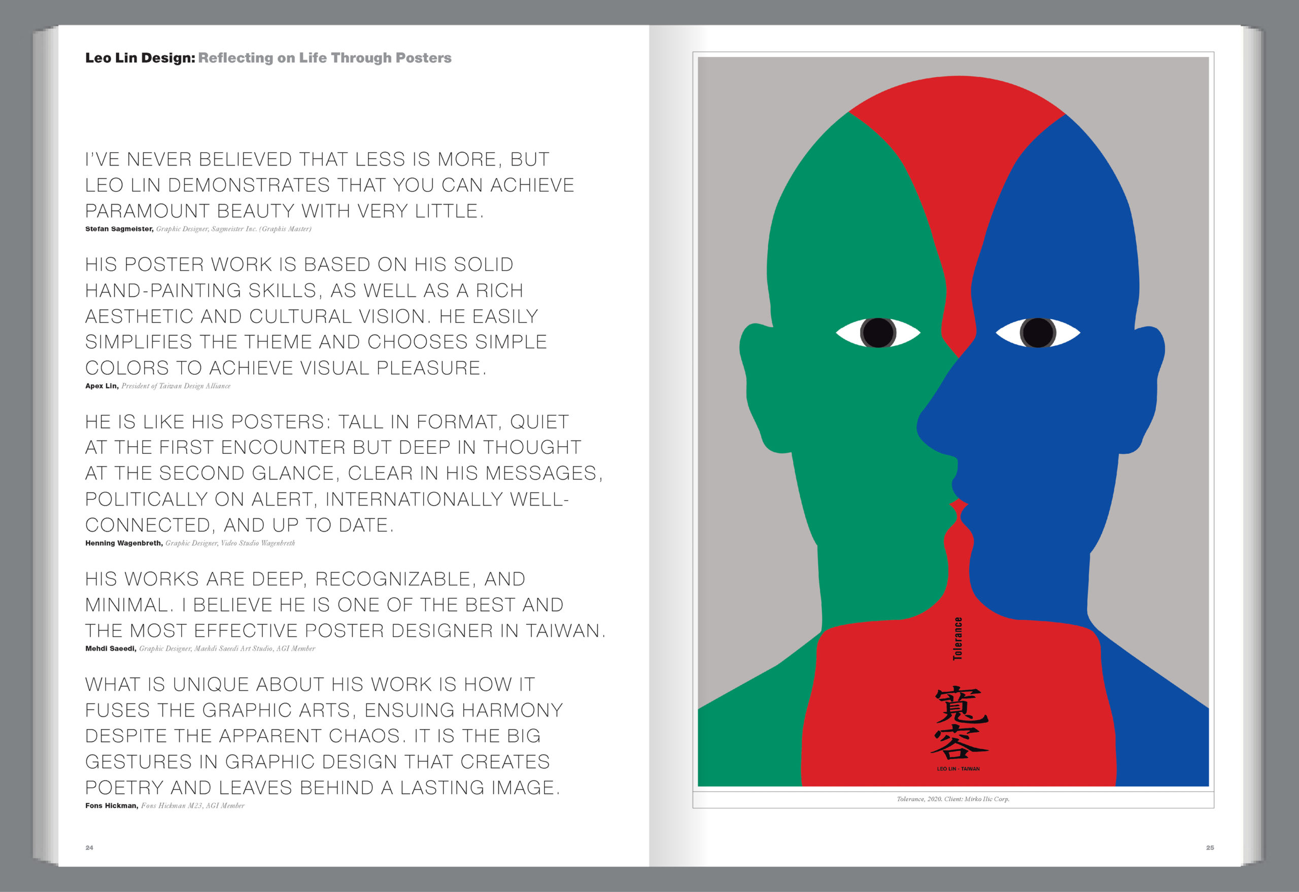
Taiwan-based designer Leo Lin, featured in Journal #368, is the art director of his studio Leo Lin Design, a professor and the director of the Department of Design at National Taiwan Normal University, and served as the president of the Taiwan Poster Design Association from 2014-2015. Throughout his career, Lin has earned praise and accolades from several different publications, including Excellent Awards in the 11th Annual Typography Competition of Communication Arts and a Platinum Award from Graphis in our Design Annual 2021 competition. Fellow designer Mirko Illić of Mark Illić Corp. describes Lin’s posters as “a perfect combination of traditional art and modern design and they combine a message with stylistic minimalism and poetry.”

Lin’s posters “Expo 2010 Shanghai China – Jin Mao Tower” (above, left), “The soliloquy of word” (above, right), and “Tolerance”(below, right) perfectly exemplify Illić’s praise. Lin juggles tradition and modernity seamlessly, using his signature command of color and line to showcase the often deep and important messages behind his designs. His posters hold true to his client’s wishes and catch the attention of anyone who lays eyes on them.

Check out a sneak peek of our Q&A with Lin below:

What is it about poster design that you are most passionate about?

Through poster design, I can express my reflections on human life, fulfill myself, and become a bridge that connects humans, society, and the environment.

What has been your most memorable project?

It should be Korean Image in 2001. Before I was first invited to design a poster for the Korean Image Exhibition, I had never been to Korea nor did I feel much about it. My only connection with Korea at the time was a pair of Korean traditional shoes given to me from a Korean competitor as a friendship keepsake when I entered a Worldskills competition in the UK in 1989. The shoes and the Korean traditional color stripes on them became the elements of my design. I applied the optical illusion technique of OP Art to create a hidden image effect, implying the important value and ongoing loss of traditional culture. Little did I expect that this design would be highly acclaimed in international competitions and much loved by my Korean friends, and it has become one of my most important design works ever.

To read the rest of our Q&A and check out more of Lin’s designs, pre-order Journal #368 from our website today! To read about other designers, make sure to check out Journal #367 while you’re there!

Author: Graphis

Leave a Reply

Your email address will not be published. Required fields are marked *