Hoon-Dong Chung — A Study in Symbolism
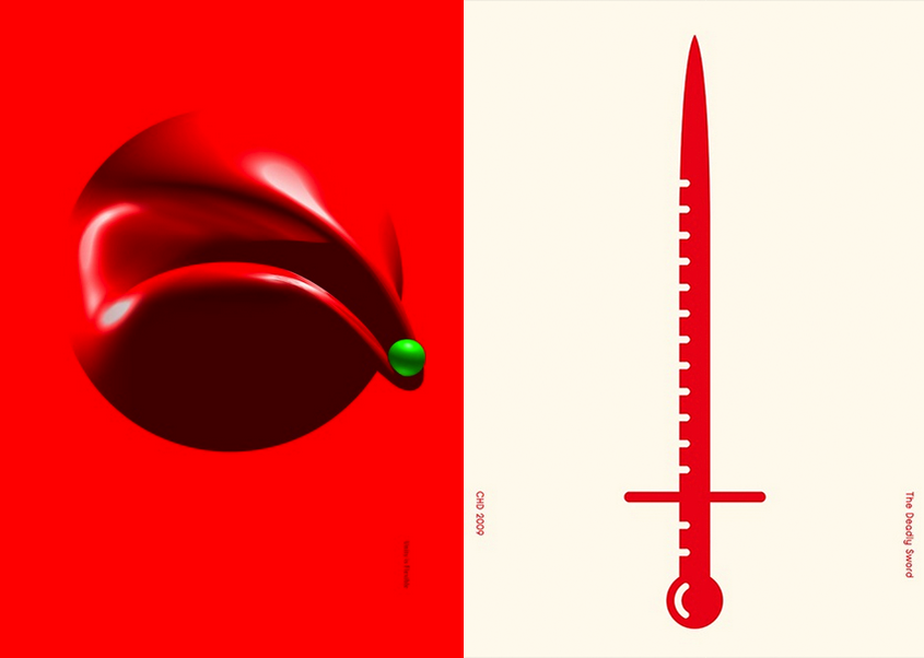
The circular contour of Hoon-Dong Chung’s Unity is Flexible is arresting in its variety of red hues. But beyond visual appeal, the graphic alludes to an underlying message, which Chung has flagrantly given us in the title: flexibility is essential in unity. The message, though clear, remains open to interpretation.
The piece was awarded a Platinum in our Graphis Design Annual 2014. Those of us here at Graphis enjoyed picking apart the multifaceted meaning in the message, and would like to extend the challenge to our readers. What is your take?
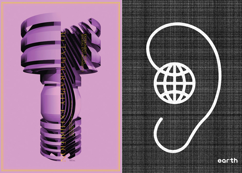
Hoon-Dong Chung is a consistent Graphis winner, who has also been awarded a Silver for his Earth’ in our Poster Annual 2014, and a Gold for ‘3D Typography Exhibition‘ in our Design Annual 2013.
Hoon-Dong was born in 1970 in Korea. He has a Ph.D. in Design and is currently an assistant professor at Dankook University. His field of study is 3D Typography. His work has been showcased in numerous exhibitions across the world, and received a bout of prestigious awards, including the Red Dot Award in the Red Dot Design Competition, the IF Design Award with If Design and numerous nominations for the German Design Award with the German Design Council.
The Design Annual 2015 competition features the most compelling and influential design of the year. Prizes consist of gold and platinum awards, with winning entries published in the Design Annual 2015. To submit your own work to the Design Annual 2015 competition, click here.
To check out more work by Hoon-Dong Chung, click here.
Designer: Hoon-Dong Chung
Category: Poster
Title: ‘Unity is Flexible’

