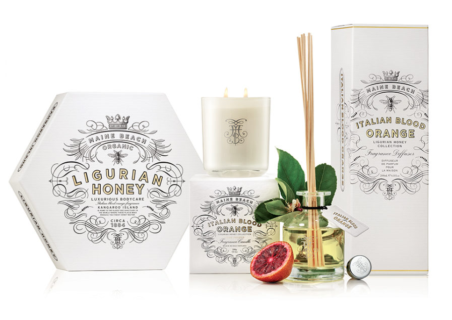
Australian designers Annette Harcus and Jaime Kim from Harcus Design created a new design for Maine Beach, a body care brand in Australia. This series, “Ligurian Honey,” contains the nectar of the Ligurian bee, resulting in a hypoallergenic and moisturizing product. These bees were originally from Liguria, Italy, so when creating this design, they incorporated an Italian theme and combined it with a honey hexagon shape. The resulting image is very elegant and reflects the origin and purity of these products. The gold of the honey contrasts nicely with the crisp white packaging.
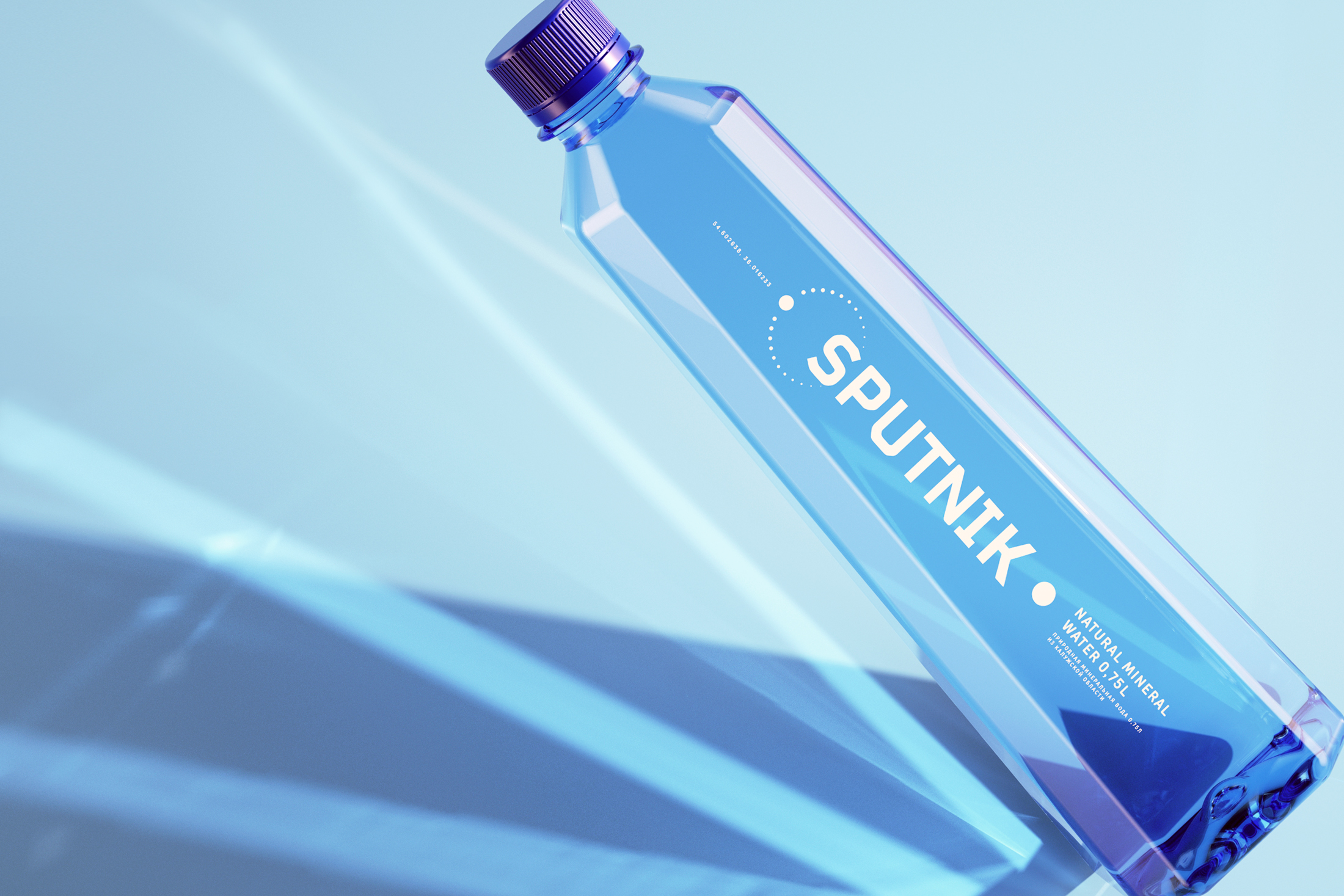
For the company Sputnik’s new design for their drinking water, designer Mushkina Kate from the Russian firm Ohmybrand aimed to visualize the spirit of the brand in order to separate it from competitors and emphasize the quality of the water. The final result was the above “Sputnik” entry. It displays a minimalistic design of the label in white, highlighting the purity of the water composition, while the rest of the bottle is a light shade of blue. The lines on the label repeat the orbit of a satellite. The unique shape of the bottle represents the quality of the water and ensures it will stand out on the shelves.
Submit your best to the Packaging 10 competition. The Graphis team hopes you and your loved ones are safe and healthy!